 Copyright © Michael Richmond.
This work is licensed under a Creative Commons License.
Copyright © Michael Richmond.
This work is licensed under a Creative Commons License.
His discussion centered on a diagram which showed the absolute magnitude and spectral class of stars. The very first versions had absolute magnitude on the horizontal axis and spectral class on the vertical axis, but within a year, he switched to the format which has been universally adopted:
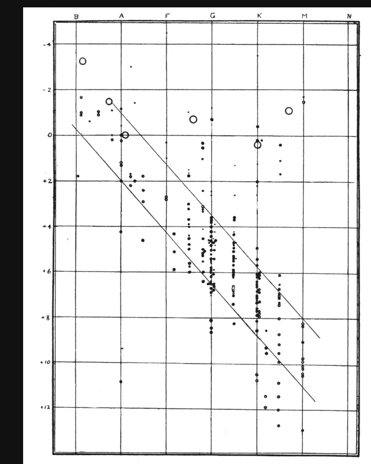
This figure appears in Russell, Nature, 93, 252 (1914)
Q: What features do you see in this diagram?
The Gaia spacecraft was designed specifically to measure the distances and luminosities of BILLIONS of stars, and that's exactly what it did. One of the papers published by the Gaia team described the HR diagrams one could create using the spacecraft's data.
We'll examine those HR diagrams in a moment. But first, let's try to figure out some way to scan the contents of a scientific paper without taking hours and hours. If you just want to cut to the heart of the paper -- finding the main point(s) it is trying to make -- I suggest following these steps:
Q: What is the title of this paper?
The abstract of our Gaia paper on HR diagrams is much longer than most; three or four times longer. That takes longer to read (BAD), but does provide a more detailed description of the contents (GOOD). On the whole, shorter would have been better, in my opinion.
In THIS case, our goal is to compare the HR diagrams measured by Gaia to those made long ago by Hertzsprung and Russell. Therefore, quickly flicking through the pages to scan the figures is exactly what we want to do.
In my experience, if the figures grab my attention, then I might start to read the body of the text of the paper. In most cases, however, one of these first three steps reveals that a paper does NOT have the information I'm seeking, so I can quickly toss it aside and move on to another one.
Okay, let's now take a peek at some of the HR diagrams shown in the 2018 paper. We'll start with Figure 5.
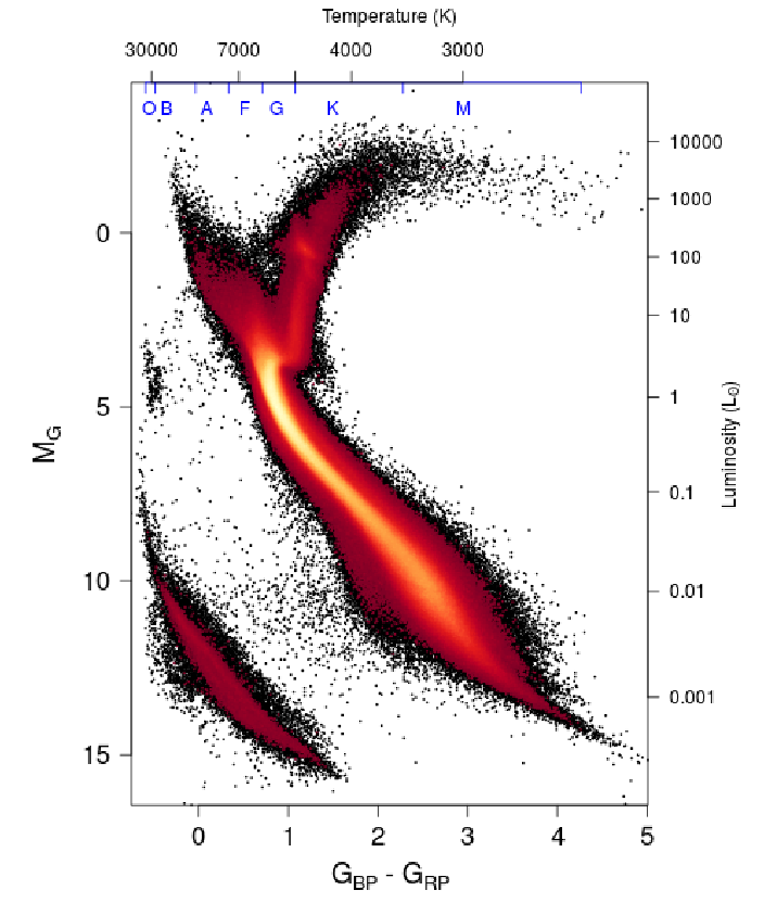
Figure 5 taken from
Gaia Data Release 2. Observational Hertzsprung-Russell diagrams
Gaia Collaboration, A&A 616, A10 (2018)
  Q:  What features do you see in this diagram?


  Q:  Which are NOT seen in the early diagram?


  Q:  Can you explain the reason for all of these features?
         In other words, can you explain why large numbers
         of stars have certain properties?
The authors of this paper describe several problems they had to address when creating proper HR diagrams. Some are due to the limitations of the Gaia instruments, but others are due to the environments of various stars in our Milky Way Galaxy.
  Read the section called "Building the Gaia HRDs."
         What sort of problems did the authors need
         to address?
Some of these problems arise because the Gaia instruments aren't perfect. Astronomers can calculate the distance to a star (and hence its absolute magnitude) by making repeated measurements of it over several years. In theory, the star's apparent position should show a combination of straight-line motion (due to its orbit around the center of the galaxy) and back-and-forth loops (due to the motion of the Earth around the Sun).
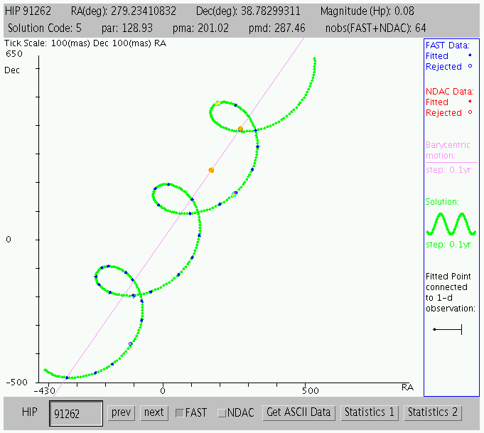
Motion of a nearby star, as revealed by the
The Hipparcos Intermediate Astrometry Data (IAD) tool.
But if a star is very distant, our measurements will be, well, noisy. And that will make the determination of the star's distance, and its absolute magnitude, even noisier.
Another of these issues is caused by tiny dust particles in space, which can scatter the light rays from distant stars on their way to the Earth.
         Q:  Compare Fig 1 with Fig 5.  What's the difference?


         Q:  What does dust have to do with that difference?


         Q:  How can we avoid the effects of dust?
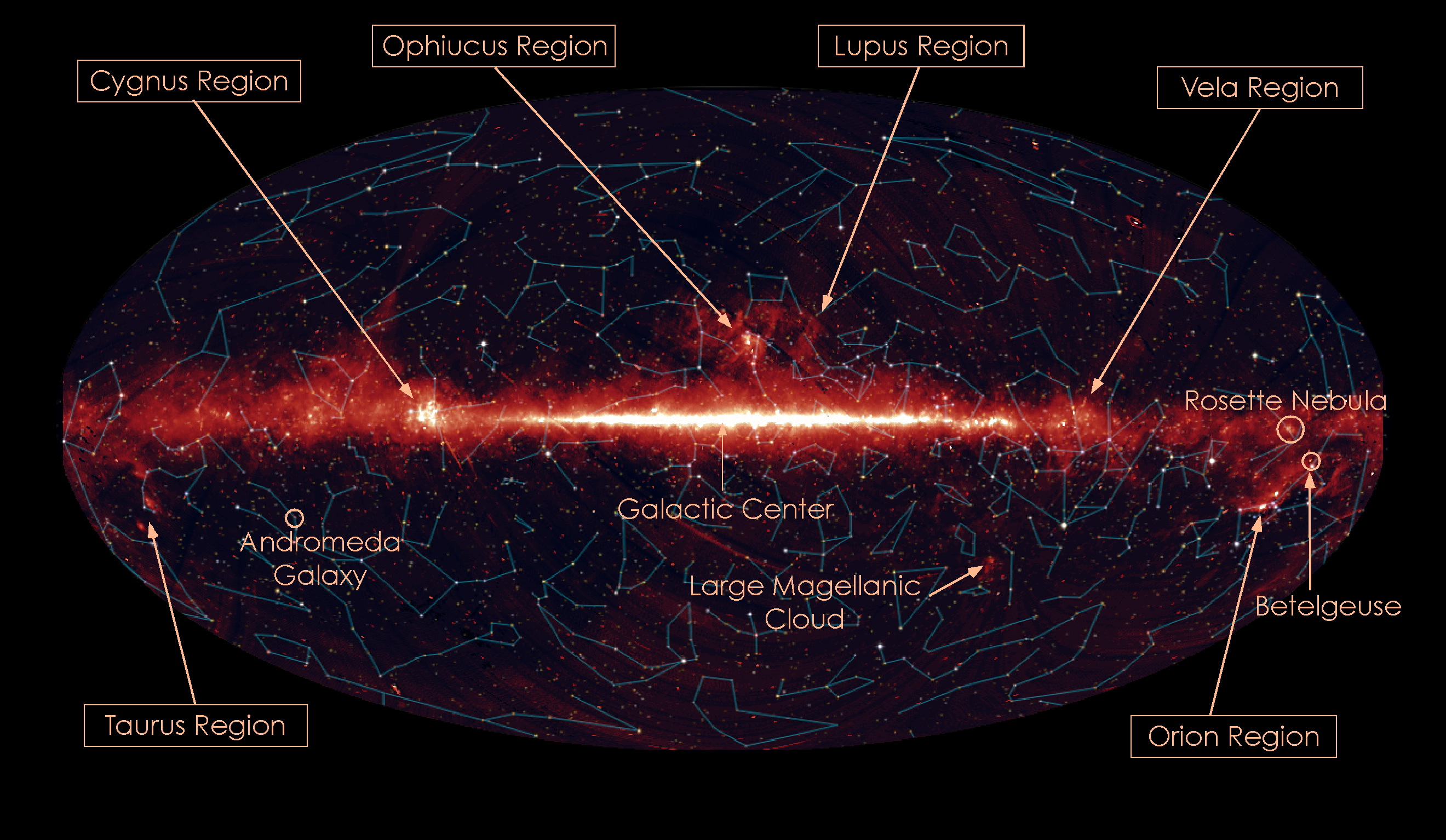
Map of the sky in the infrared courtesy of
JAXA and Akari
Sometimes, we simply don't collect information on a large enough sample of stars to see certain features in the HR diagram.
         Look at Figure 6.  What is the difference between panels a, b,
         and c?  Can you explain why panel c shows more details?
Copyright © Michael Richmond.
This work is licensed under a Creative Commons License.