 Copyright © Michael Richmond.
This work is licensed under a Creative Commons License.
Copyright © Michael Richmond.
This work is licensed under a Creative Commons License.
We now have ways to measure several properties of stars:
But what good does it do? We can make up tables containing hundreds or thousands of stars, with columns for apparent magnitude, temperature, etc. -- okay. It would help, though, if we could discover just a few simple relationships between these variables; humans are very good at remembering and pondering a few, simple rules, but very bad at remembering thousands and thousands of numbers.
Are there any simple relationships hidden in this wealth of data? The answer, of course (why else would I ask the question?) is YES. Let's set the Wayback Machine for the early 1900s, when astronomers first compiled the raw numbers for hundreds of stars ....
Today, we're going to explore some "old" papers which include the first examples of the HR diagram. How did I FIND these papers, out of the tens or hundreds of thousands of articles on astronomy published in the past 150 years? I used a very useful tool called the Astrophysics Data System, or "ADS" for short.
Since most astronomers use this tool frequently in their research, you ought to know how to use it, too. Let's visit it to look for these seminal papers.
  Q:  For which authors should we search?


  Q:  Roughly when do you think these papers were published?
Right. Let's look for papers
If you look at the end of this lecture, in the section labelled for more information,, you'll find links to some of the most relevant papers returned by this search.
So we don't forget, there's an assignment for you to carry out with ADS before the next class.
One of the astronomers who gathered together in one place measurements of many stars was the Danish scientist Ejnar Hertzsprung. He wrote several papers in which he identified correlations between different variables. However, since he presented his work in tabular form, it wasn't easy to grasp the signficance of any particular relationship. Moreover, he published in rather obscure journals. As a result, when his work was first published around 1905, it did not make big waves.
Several years later, another astronomer dug into the data independently. Henry Norris Russell was a famous scientist at a prestigious institution, Princeton University, so people tended to pay attention to his work. Moreover, he singled out one particular relationship between stellar properties and presented it in a graphical form. In 1913, he described his findings at a meeting of the Royal Astronomical Society.
His discussion centered on a diagram which showed the absolute magnitude and spectral class of stars. The very first versions had absolute magnitude on the horizontal axis and spectral class on the vertical axis, but within a year, he switched to the format which has been universally adopted:
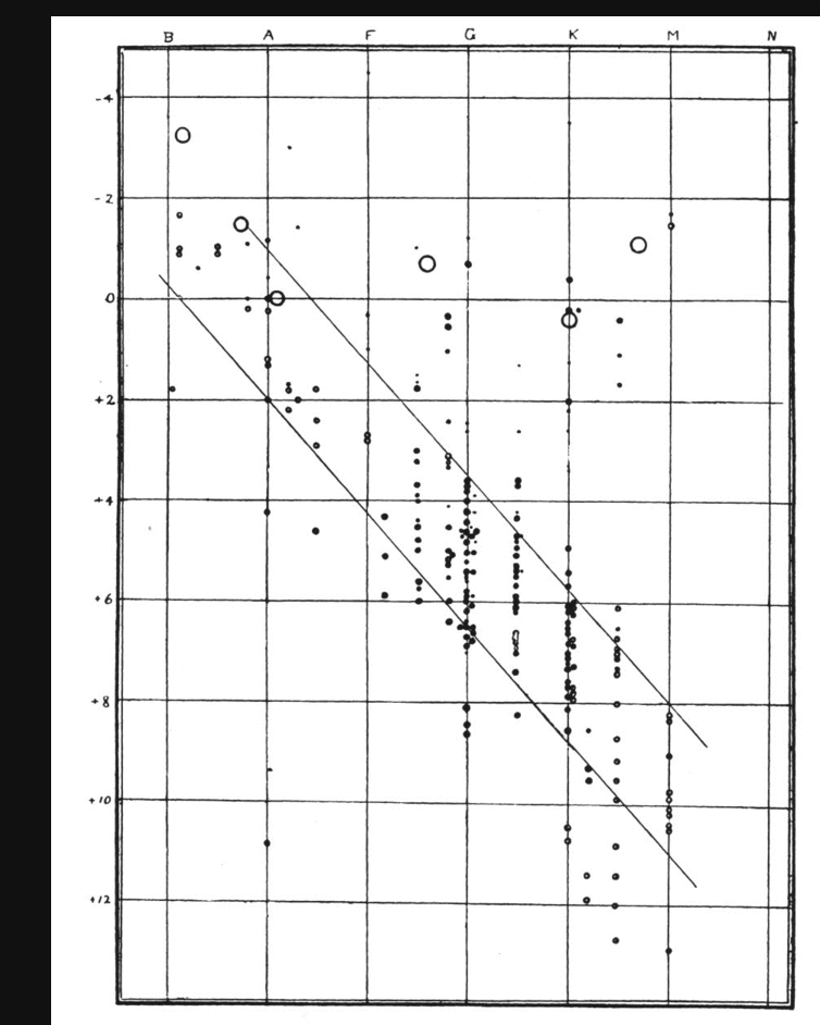
This figure appears in Russell, Nature, 93, 252 (1914)
Long after Russell's graph first appeared, another astronomer pointed out that the same relationship had appeared previously in Hertzsprung's work. We now recognize the achievements of both astronomers by referring to it as the Hertzsprung-Russell diagram, or "HR diagram" for short.
You may be saying to yourself, "Well, um, okay, so Russell made a diagram. What's the big deal?" Let's go over the diagram slowly.
There are several different ways to label the axes, and you may see different combinations in different places. Let's start with the vertical axis: in Russell's original, it shows absolute magnitude. But we can replace this with any measure of the true power output of the star. The usual possibilities are
  Q: Where are the powerful stars in this diagram?

  Q: Where are the feeble stars in this diagram?
Right. Powerful at top, feeble at bottom.
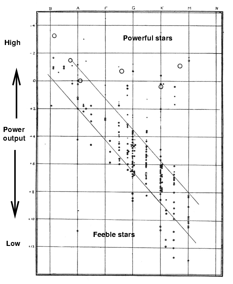
  Q: The Sun has (roughly) absolute magnitude V = 5.
     Where does it fall in this diagram?

     How many solar luminosities do stars at
     the top of the diagram produce?

     How many solar luminosities do stars at
     the bottom of the diagram produce?
The horizontal axis is, in the original, labelled "spectral class". But that's not the only quantity which one can find on this axis: there are two other quantities which are roughly equivalent, and which frequently appear in its place. You may see any of these three variables on the horizontal axis:
So, for example, if we use color index, the graph would look like this:
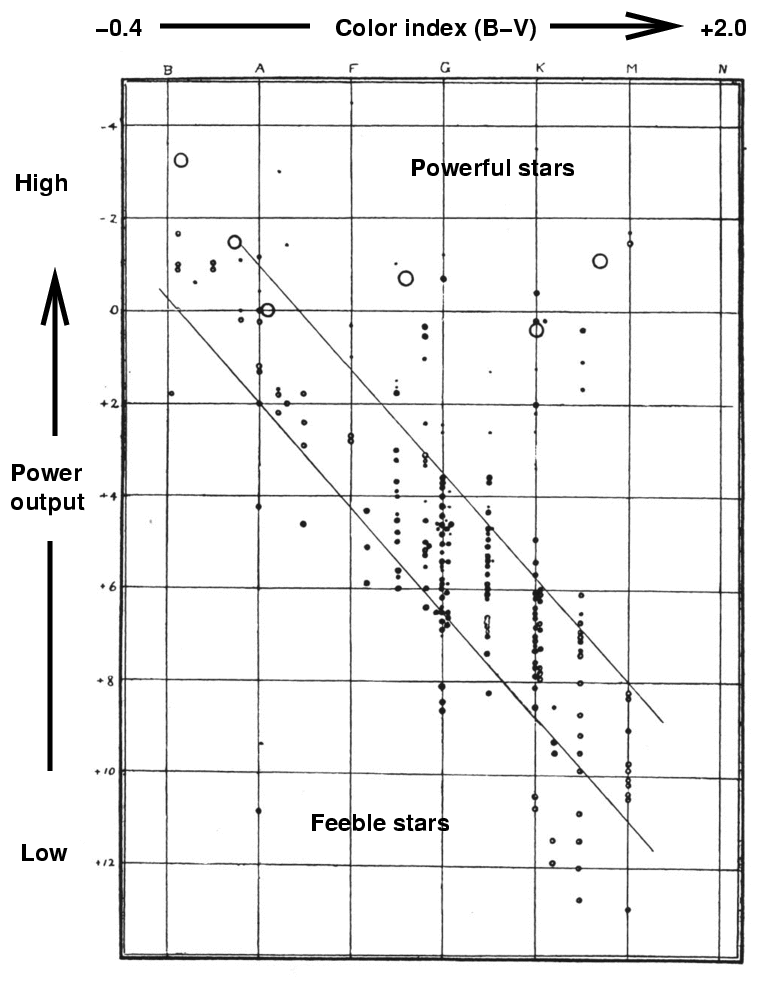
  Q: Where are the hot stars in this diagram?

  Q: Where are the cool stars in this diagram?

  Q: Where are the blue stars in this diagram?

  Q: Where are the red stars in this diagram?
Right. Hot, blue stars on the left, cool, red stars on the right. Note that temperature runs backwards on this diagram.

Now, Russell noticed that the great majority of the stars in the catalogs of his time fell in a band which ran from the upper left to the lower right. He indicated this in his version of the diagram with lines; we now call this region the main sequence.
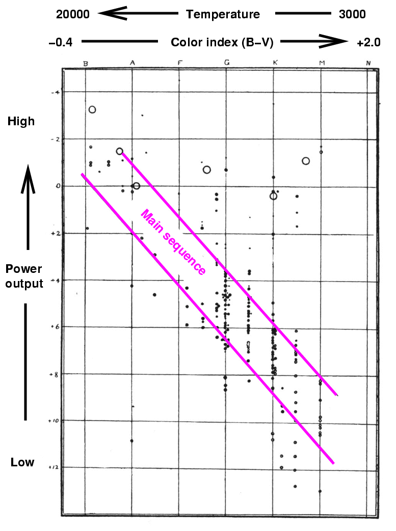
He also noticed the difference in the other two corners of the diagram: there were some stars in the upper right, but very very few stars in the lower left. Hmmmm. What could this mean?
Well, think for a moment about these corners. Stars in the upper right region are powerful and cool.
  Q:  How does the temperature of a star
      affect the power it emits from each
      square meter of its photosphere?


  Q:  So what does this imply about stars
      which are both powerful and cool?
Right. These stars must be very large -- they must have a very big surface area in order to produce so much power with at such low temperatures. Hertzsprung gave the name giant to the stars with this combination of features, and we have kept it ever since. You often see the term red giant, since most of the stars are reddish. Note that this important feature of the stellar population -- that cool stars come in two sizes -- is a simple consequence of the gap between the bright and faint groups on the right-hand side of this diagram.
Both Hertzsprung and Russell noticed this gap between the luminous and feeble red stars, and decided to give names to the two groups. If the powerful red stars are called "giants", then the feeble red stars should be called .... "dwarfs."

And so they were (and are).
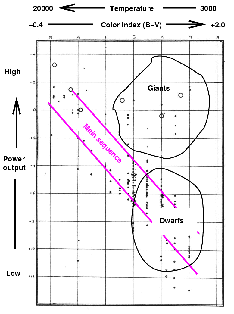
However, Russell realized that these "red dwarfs" were really just the cool end of the main sequence of stars. As a result, he decided to extend the term dwarf to refer to ANY member of the main sequence, not just the red end.
So, you may sometimes see these labels on stars:
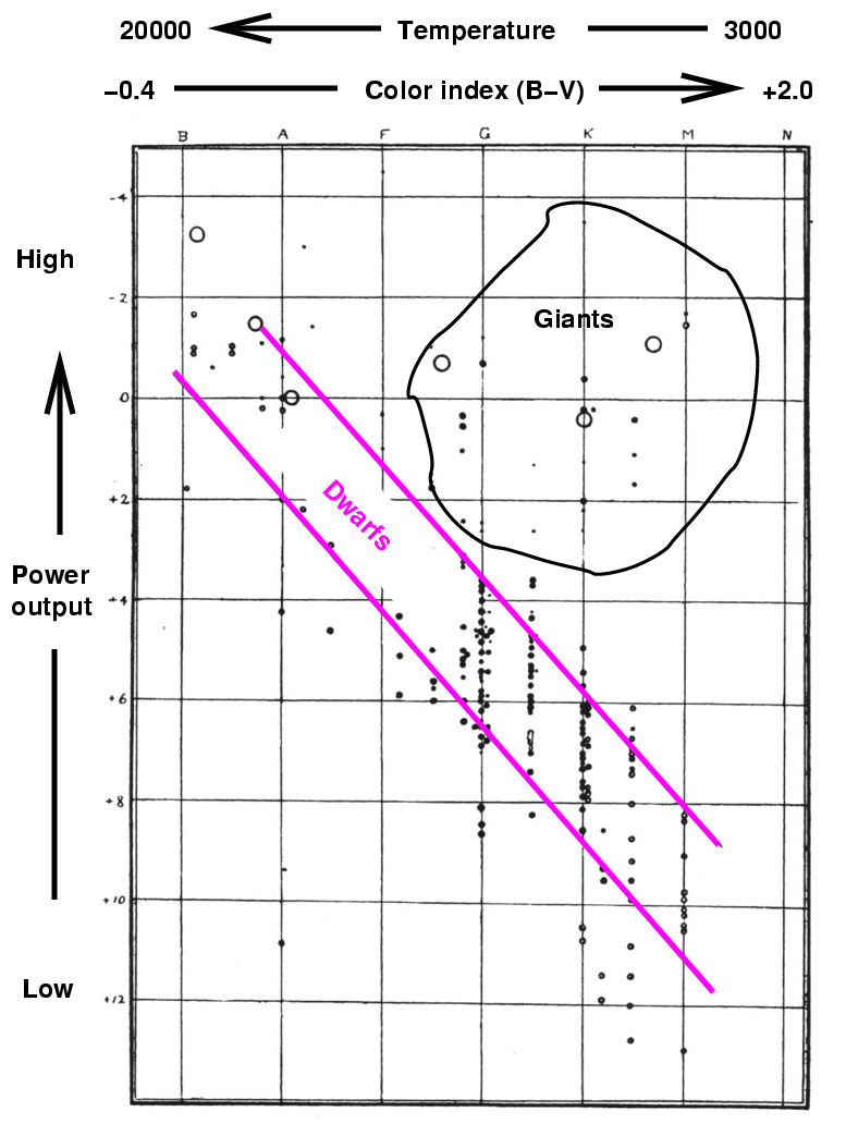
At the time Hertzsprung and Russell created this diagram, they knew of very few stars which fell in its lower left corner: stars which were hot, yet feeble.

  Q:  What sort of star could be very hot,
      yet produce little power?
Right. The only stars which could fall in this region of the HR diagram would be very small stars. And when I write, "very small", I mean "much, much, MUCH smaller than ordinary stars." Just how small would they have to be? Look at Russell's diagram: there is one dot at
  Q:  What is the luminosity of this star?
      Express your answer in Watts, and in terms
      of the solar luminosity (3.8 x 1026 Watts).
Now, if this star emits radiation like a blackbody, then its luminosity depends simply on its radius R, temperature T, and the Stefan-Boltzmann constant σ = 5.67 x 10⁻⁸ Watts per sq.m. per K4.
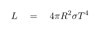
If we know the luminosity and temperature and want to find the radius, we can turn this equation around:
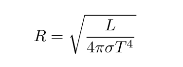
  Q:  Assuming this star emits like a blackbody,
      figure out its radius in meters.
      Then compare it to the size of the Sun
      (which has radius roughly 700,000 km).
Because stars in this region of the diagram are so small, astronomers could not help themselves: they use the term "dwarfs" to refer to these tiny hot stars, even though they do not fall on the main sequence, and even though they are an order of magnitude smaller than the "red dwarfs" at the lower end of the main sequence. Since these stars are hot, though, they receive the name white dwarfs.
When we meet next, on Sep 7, we will look at a more recent version of the HR diagram. I'd like you to prepare for class by reading -- or skimming -- portions of a paper. Look for it on ADS with these clues:
Please do the following two things, and be ready to discuss in class:
Copyright © Michael Richmond.
This work is licensed under a Creative Commons License.