 Copyright © Michael Richmond.
This work is licensed under a Creative Commons License.
Copyright © Michael Richmond.
This work is licensed under a Creative Commons License.
Last time, we discussed making measurements of the brightness of stars through broad-band filters: that's called "photometry". A more powerful -- but also much more complicated -- technique is to break the light from a star into a rainbow, or spectrum, in order to measure the amount of light it radiates as a function of wavelength. This is spectroscopy.
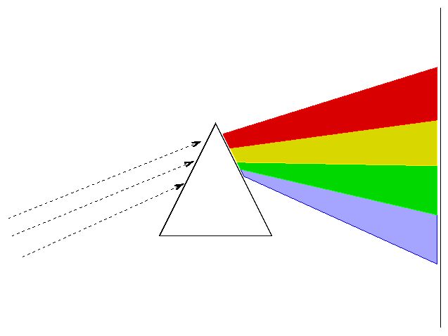
In the late nineteenth and early twentieth centuries, astronomers used spectrographs to measure the light from thousands of stars. They soon recognized a number of patterns.
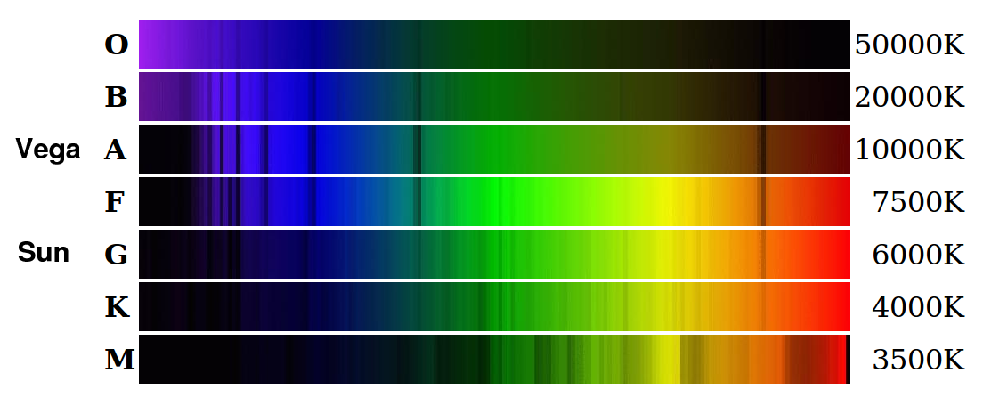
Image courtesy of
Michael Lemke and Simon Jeffrey.
Scientists at Harvard classified stars based (largely) on the appearance of hydrogen absorption lines into a series of spectral classes: O, B, A, F, G, K, M, as well as numbered sub-classes within each category.
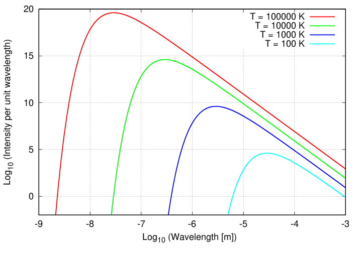
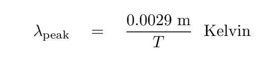
Looking at the CONTINUUM shape of stellar spectra, it seems that most stars are reasonable approximations to a blackbody. Here are examples of blackbody spectra ...
... and here are some stellar spectra.
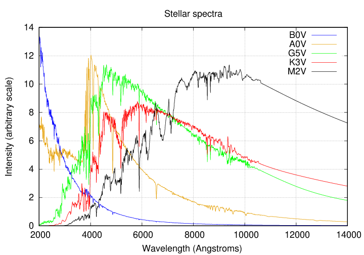
In that case, there is a relatively simple connection between the wavelength at which the spectrum reaches a peak, and the temperature of the star's photosphere.
  Q:  Can you estimate the photospheric temperature of
           these main-sequence stars?
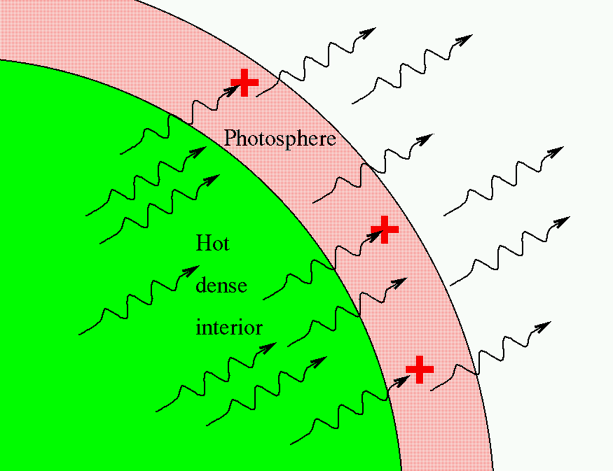
But stellar spectra contain much more information than the simple continuum shape. Impressed upon that continuum are a set of absorption lines due to the atoms, ions, and molecules in the outermost layers of a star's atmosphere. As the photons from the hot interior fly through these outer layers, some are absorbed by those particles.
The number and strength and shape of these lines can reveal a number of physical properties of the gas in those outer layers:
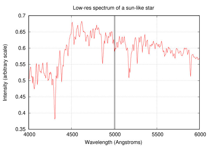
How many lines can you count in this low-resolution spectrum of a sun-like star, covering 2000 Angstroms?
But that's only the tip of the iceberg! If one uses a big telescope with a high-resolution spectrograph, one can see SO MANY MORE features in just a teeny sub-section of this wavelength range -- just 10 Angstroms.
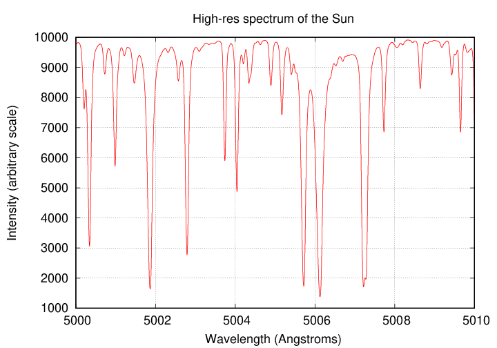
High-resolution solar spectrum courtesy of
BASS 2000
   Q:  If one acquired a high-resolution spectrum of the entire
           range from 4000 to 6000 Angstroms, how many lines
           might one be able to measure?
One of the astronomers who gathered together in one place measurements of many stars was the Danish scientist Ejnar Hertzsprung. He wrote several papers in which he identified correlations between different variables. However, since he presented his work in tabular form, it wasn't easy to grasp the signficance of any particular relationship. Moreover, he published in rather obscure journals. As a result, when his work was first published around 1905, it did not make big waves.
Several years later, another astronomer dug into the data independently. Henry Norris Russell was a famous scientist at a prestigious institution, Princeton University, so people tended to pay attention to his work. Moreover, he singled out one particular relationship between stellar properties and presented it in a graphical form. In 1913, he described his findings at a meeting of the Royal Astronomical Society.
His discussion centered on a diagram which showed the absolute magnitude and spectral class of stars. The very first versions had absolute magnitude on the horizontal axis and spectral class on the vertical axis, but within a year, he switched to the format which has been universally adopted:
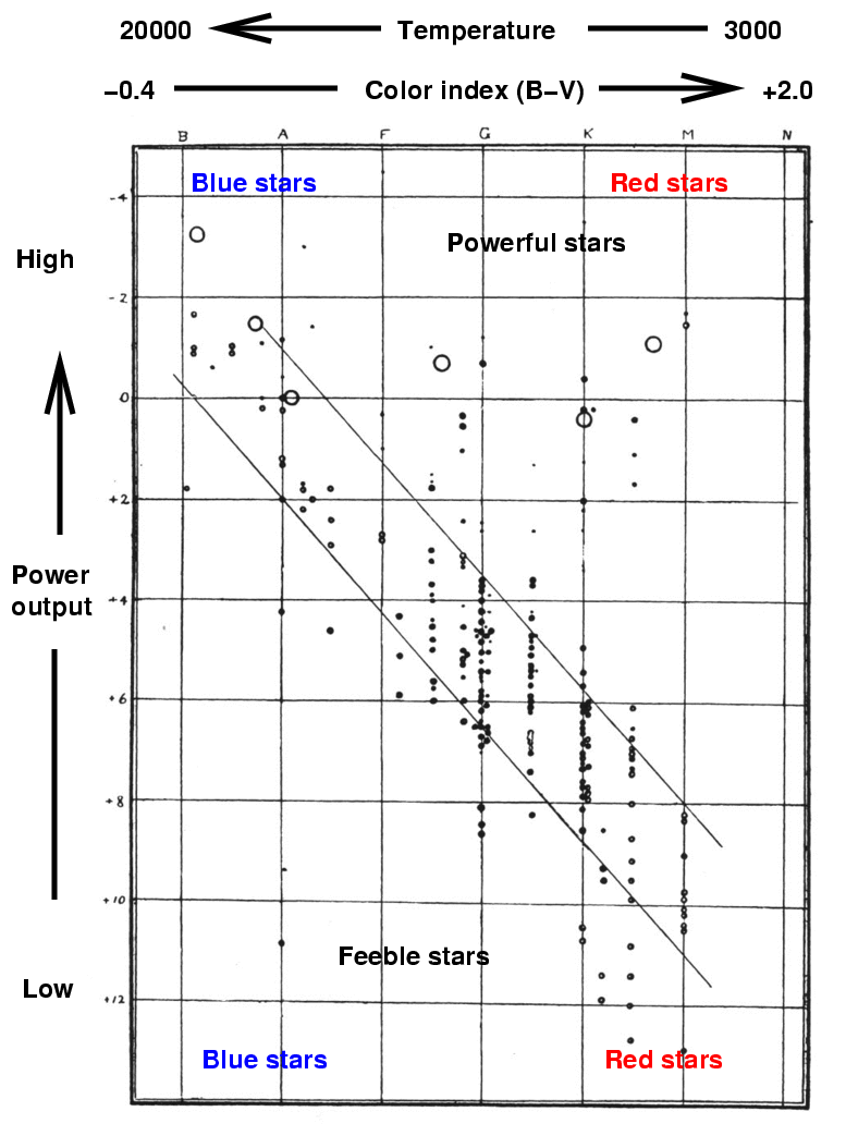
The original version of this figure appeared in
Russell, H. N., Nature, 93, 252 (1914)
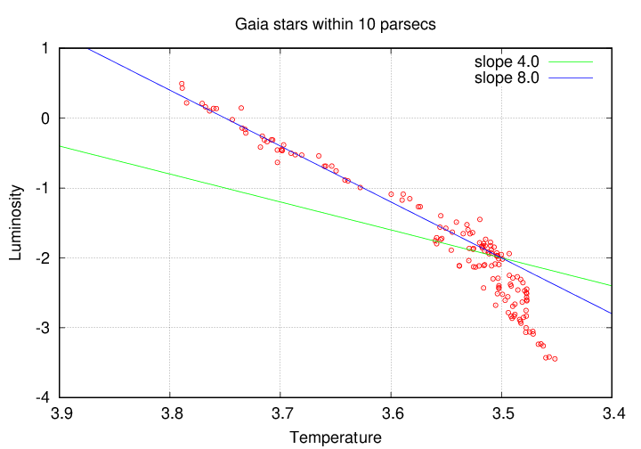
That very early "HR" diagram does show the essential features which make it so fundamental to understanding stars, but the quality of the measurements is, well, not so great. Let's make our version of the diagram, using much better data provided by the Gaia Spacecraft Archive.
Download the "10 pc" datafile to your computer and make a graph. Place the (BP - RP) color on the horizontal axis, with a range from -0.4 (on the left) to +5.0 (on the right). Plot the absolute G magnitude on the vertical axis, with a range from 20 (on the bottom) to -5 (on the top).
    Make this graph, then compare yours to the graphs made
      by other students sitting nearby.  If you need help,
      ask the instructor.
Here's my version:
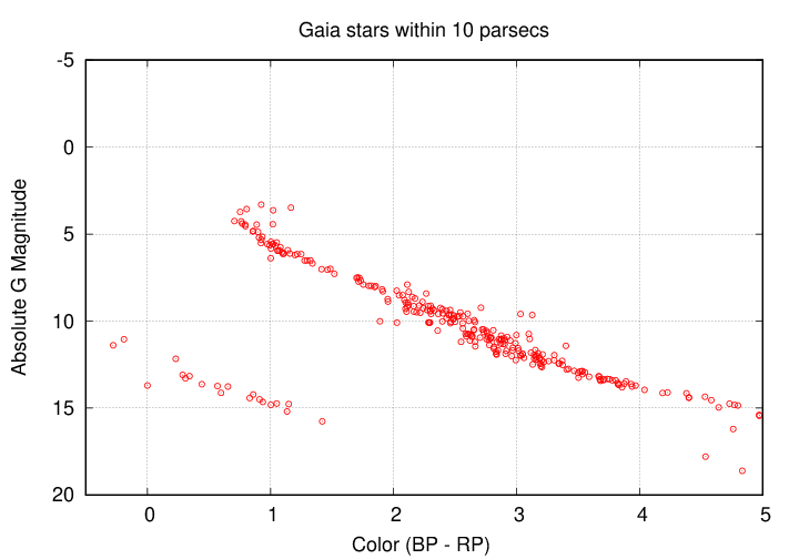
Let's use these graphs to answer a few questions about stars.
Those are rather qualitative questions. We can try some quantitative analysis, too.
Finally, we can consider the consequences of selection effects on this particular diagram.
Well, here's a diagram showing stars in the Gaia catalog down to apparent magnitude m(B) = 18 and out to distance d = 33 pc. Compare the "nearby" stars (out to d = 10 pc, in red) to the "more distant" stars (out to d = 33 pc, in blue).
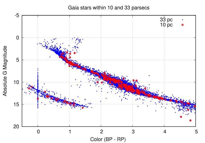
  Q:  Do you now see stars with much fainter absolute magnitudes?
            Why or why not?

  Q:  Do you now see stars with much brighter absolute magnitudes?
            Why or why not?
Copyright © Michael Richmond.
This work is licensed under a Creative Commons License.