When one analyzes a set of data from Tomoe, one occasionally finds strange or unexpected events. Are they real? Well, sometimes, strange results can be caused by what I'll call bad weather -- observing when
During periods of "bad weather", we might expect some real objects to disappear, even if their luminosity is not really changing.
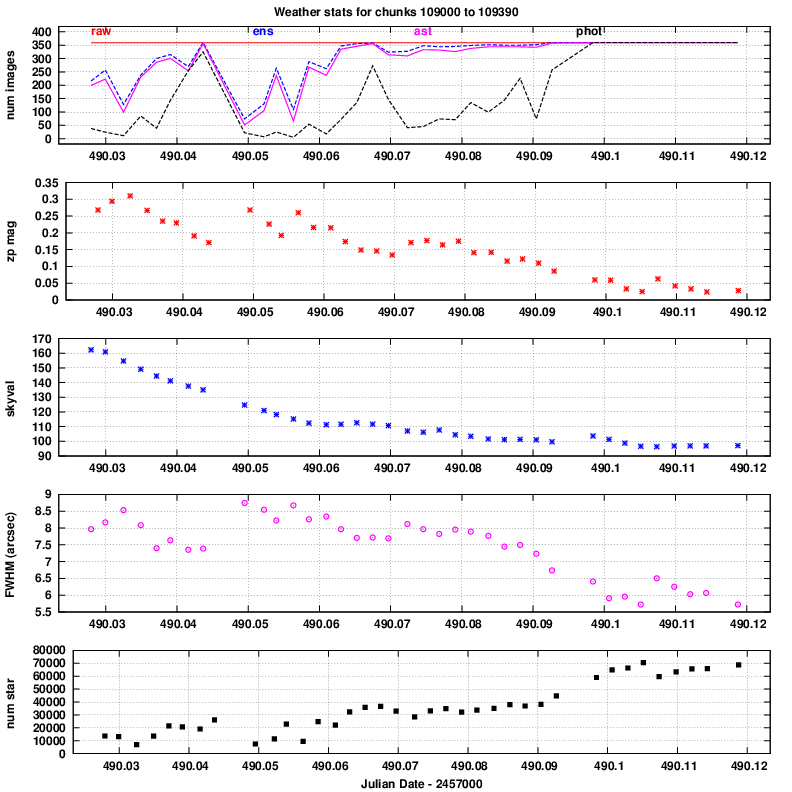
In order to help us understand the data from Tomoe, I have created a tool which uses information output by the Tomoe pipeline to create a single large graphic covering some space of time, up to a single night; the graphic shows several indicators of the data quality, acting like a "weather report."
Below is an example, showing properties of some data taken on Apr 11, 2016. The dataset is the composite FITS file TMPM0109330.fits, which contains 360 Tomoe images taken during a period centered on JD 2457490.1051285 = 2016 April 11 14:31:23. The field location is
(J2000) RA = 196.5758 Dec= -16.2223
The conclusion one can easily draw from this particular set of data is that the conditions improved from the start of the run to the end, as the following explanations should make clear.
The panels show
In this panel, a large value is GOOD.
zero_point = (intrumental_aper_mag) - (UCAC4_V_mag)
So, larger numbers (more positive) mean "lots of clouds", and smaller numbers (more negative) mean "more clear."
In this panel, a large number is BAD.
In this panel, a large number is BAD.
In this panel, a large number is BAD.
In this panel, a large number is GOOD.