This document is a sort of a diary, noting events as I continue to work on finding a way to use colors of stars in the SDF to diagnose their types.
Using Johnson-Cousins UBV magnitudes, we can make a color-color diagram full of features. The Besancon model provides UBV magnitudes for all the stars in its simulations, so we can use it as a base. Below is the color-color diagram for selected stars from the Besancon model; note that these are not the stars expected to be found in the SDF, but simply a large set of stars of all spectral types, taken from a simulation of a region of the sky in Cygnus.
The colored dots are all main-sequence stars; each group represents stars of a narrow range of spectral type, within 1 subclass (so "A5" might be "A4" to "A6"). However, each group includes stars of a range of metallicities.
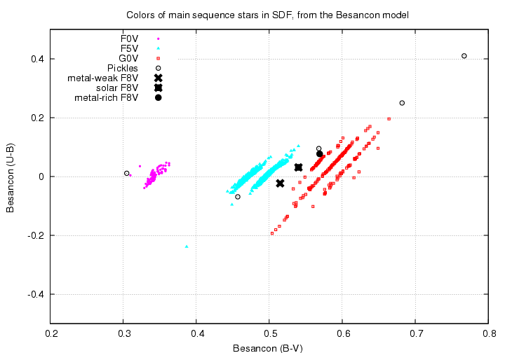
I've used Pickles library of stellar spectra to compute synthetic magnitudes through the Bessell versions of the Johnson-Cousins passbands. The Pickles stars start at B5 and go through the range A0, A5, F0, ..., M0, M5. I used Vega as the zero-point for all the synthetic photometry: the magnitude of Vega is forced to be zero in each passband U, B, V. Note how well the synthetic photometry agrees with the Besancon model photometry.
Metallicity affects the location of a star in this diagram in the following manner.
this U-B vs. B-V color-color diagram
As a check on this behavior, I computed synthetic photometry for three particular spectra in Pickles' library.
As the diagram below shows, the same trend appears: high metallicity moves a star to the upper-right.
Luminosity class also affects the location of a star in this (U-B) vs. (B-V) diagram. Here's a closeup showing the blueish portion of the diagram.

The left-hand clump shows A7 stars. The main-sequence stars lie somewhat lower in the diagram than the giants; in other words, they have bluer (U-B) colors for a given (B-V). The right-hand clump shows G7 stars. In this case, the main-sequence stars lie to the lower-left, and giants to the upper-right.
What about white dwarfs? It turns out that the HOT white dwarfs are very well separated from normal stars in the (U-B) vs. (B-V) color-color diagram, though the cool white dwarfs lie close to the main locus. I do not have any good model spectra of WDs, but I was able to find tables of synthetic magnitudes for WDs in the Johnson-Cousins and also the Sloan ugriz passbands at
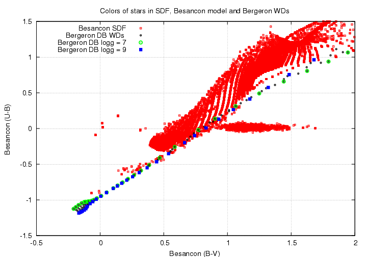
Using the Johnson-Cousins magnitudes for pure-hydrogen WDs, we can see the clear separation on a color-color diagram:

The higher a WD's surface gravity, the farther it lies from the locus of hot main-sequence stars, which curves up at this location.
We can repeat this comparison with helium-rich DB white dwarfs. The position of these DB white dwarfs on the color-color diagram is almost the same as the DA white dwarfs. The cool DB WDs lie slightly higher in the diagram than the cool DA WDs, but the difference is just a few tenths of a magnitude.
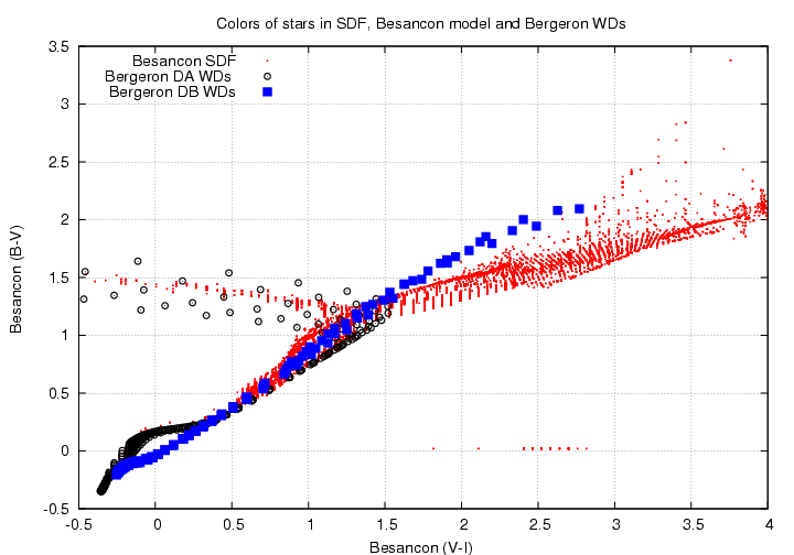
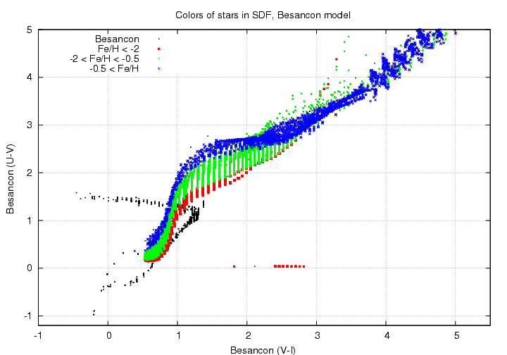
Let's look at features in the stellar locus in the (B-V) vs. (V-I) color-color diagram. As above, these are Johnson-Cousins magnitudes, with Vega = 0.0 (or close to it) in all passbands.
The Besancon model for the SDF predicts that we should see something like this:

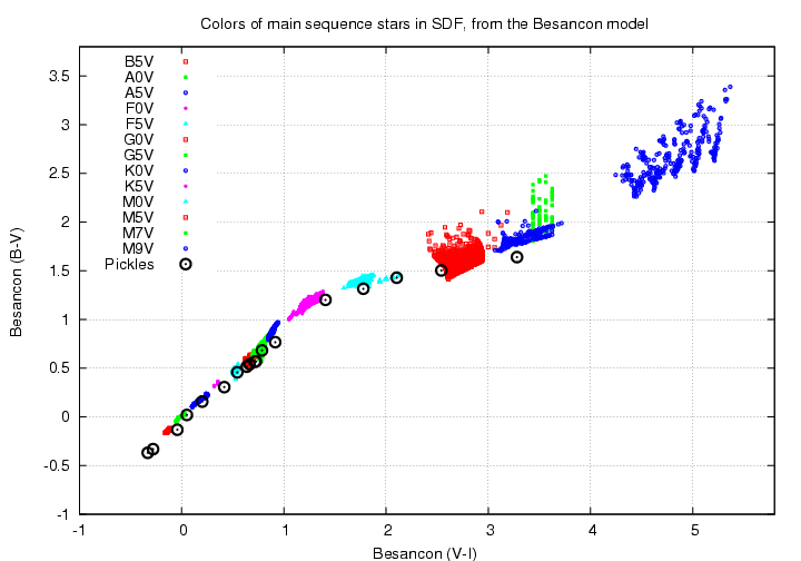
If we break the main locus down into main-sequence stars of different types, we end up with this. Note the compression in the locus for stars of type FGK. This graph also shows the location of synthetic photometry of stars from the Pickles atlas; it matches up nicely with the Besancon locus without any offsets.
What are the effects of metallicity? Well, if we look at the middle of the locus, in the range of A-K stars, we see that stars with low metallicity lie at the bottom of the wide main sequence, and stars with high metallicity lie near the top of the sequence. In fact, for the K stars, high metallicity pushes stars upwards and to the right as well.
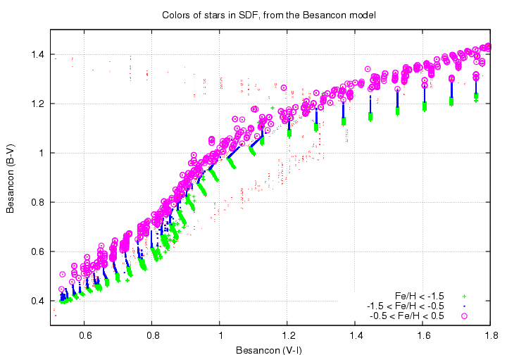
On the other hand, for M dwarfs, there's a change: stars of low metallicity turn upwards to make a thin little line, while stars of high metallicity (expected to be more numerous) continue to the right.

We can also look at the location of white dwarfs in this diagram. The hydrogen-rich DA white dwarfs make a drastic turn to the left as they cool, due to absorption by hydrogen molecules in their atmospheres. Helium-rich DB white dwarfs, on the other hand, continue to grow redder in both (B-V) and (V-I). They end up lying a bit higher than ordinary M stars.
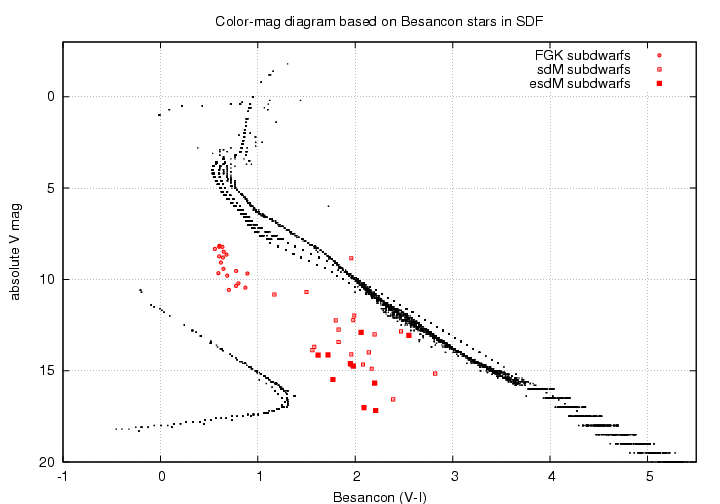
Let's try to place the actual SDF stars, from the catalogs of Kashikawa et al., onto the (B-V) vs. (V-I) diagram. In the diagram below, I've chosen a very small set of the objects in the Kashikawa catalogs to plot on top of the Besancon simulation. These are objects with very stellar shapes and magnitudes in the range 20.5 < R < 22.0, which I determined in Richmond (2005) were very likely to be stars.
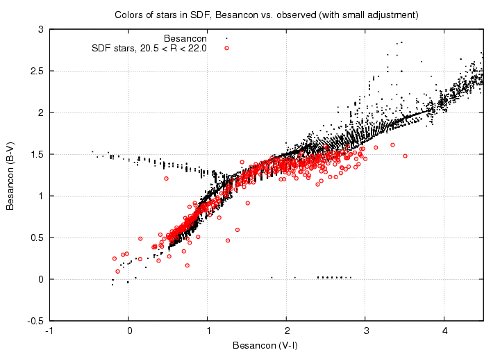
In the diagram above, the colors of the real stars look decently close to those of the simulated stars. I had to modify the real colors to make that happen. I followed Richmond et al. (2009) in making the Johnson-Cousins (V-I) color be
Johnson-Cousins (V-I) = 0.391 + 1.1145*(Vs - i')
and I also just shifted the (B-V) colors by a small amount to make the stellar loci overlap.
Johnson-Cousins (B-V) = (Bs - Vs) + 0.15
Actually, a value of 0.10 works better at the blue end of the locus, and a value of 0.20 works better at the red end.
Okay, so let's apply these same small shifts to the measured colors of the proper motion candidates in the SDF, and put THEM onto this color-color diagram.
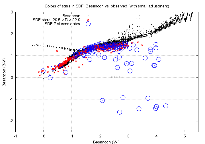
Hmmm. Some of the "features" in this diagram are just plain wrong.
If you can find the U-band measurements for these 4 objects, it should be clear if they are WDs or not. The objects are listed at the HTML page of PM candidates
   see  mahina: /home/michael/sdf/referee_matchrad/html_page/sdf_pm.html

     cand ID           RA             Dec               comment
     30340           201.06654        27.27336           DA white dwarf?
      9687           200.95944        27.46232           DB white dwarf?
     79929           201.31400        27.70335
     23968           201.03344        27.74886
I tried to identify objects in this color-color plot which might correspond to the halo subdwarf objects we mention in our Richmond (2009) paper. Most of the objects which lie a distance below the main stellar locus are too red to be halo subdwarfs; the subdwarf candidates have Johnson-Cousins colors 1.5 < (V-I) < 2.5. These are mixed up pretty well with ordinary low-metallicity stars in the color-color diagram, so they don't stand out here.
However, these stars would stand out, I think, in a (U-B) vs. (B-V) color-color diagram. Again, if you can create such a diagram and place the PM candidates on it, we might be able to find a group which corresponds to the halo subdwarfs. As a guide, you might see where this star falls in the (U-B) vs. (B-V) diagram:
   see  mahina: /home/michael/sdf/referee_matchrad/html_page/sdf_pm.html

     cand ID           RA             Dec               comment
     49398            201.16001      27.57608         halo sub-dwarf?
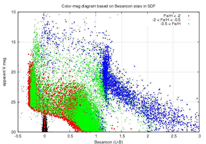
In every case below, I plot the absolute V-band magnitude on the y-axis, so that luminous stars are at the top and feeble stars at the bottom.
First, let's look at (U-B) color on the horizontal axis. The main sequence runs through the diagram diagonally. Low-metallicity stars are at the left-hand side of the main sequence, and high-metallicity stars at the right-hand side. The small gap between V=8 and V=5 separates stars with (Fe/H) > -0.3 (to the right of the gap) from those with (Fe/H) < -0.3. I'm not sure if it is a real effect, or just due to a shortage of some type of star in the Besancon model.
White dwarfs lie at the bottom-left corner of the diagram. In this case, DA and DB white dwarfs have the same colors; both slide to the lower-right as they cool. White dwarfs with high surface gravities will fall lowest on the plot; the model has stars with (log g) = 7.5 or so. The big clump of white dwarfs with color (U-B) = 0 are all halo objects.

Next, we can look at (B-V) on the horizontal axis. The features are largely the same, but with a few changes. In the white-dwarf region, cool DB stars will lie slightly above the DA stars which are shown (for example, a helium-rich white dwarf with (B-V) = 1.5 will have absolute magnitude 16 instead of 18). You can also see a small branch of very red stars, 2 < (B-V) < 3, which lies slightly above the main locus; those are metal-poor stars with (Fe/H) < -1.0.

Finally, we can look at (V-I) on the horizontal axis. Note how narrow the main-sequence has become. As before, the high-metallicity stars lie on the right-hand side of the main sequence and low-metallicity stars on the left-hand side; however, in this diagram, for low-luminosity stars of MV > 10, the locations switch: the high-metallicity stars move to the left-hand side, and low-metallicity stars to the right-hand side. Very metal-poor subdwarfs aren't in the Besancon model, so I've added a few from Neill Reid's collection of subdwarfs; note how they would follow the main sequence, about 2 magnitudes below it.
Note the strong bend in the locus of DA white dwarfs as they cool. The helium-right DB white dwarfs do not follow this bend; they continue to move to the right as they cool.
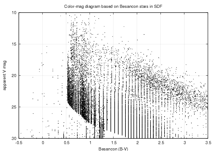
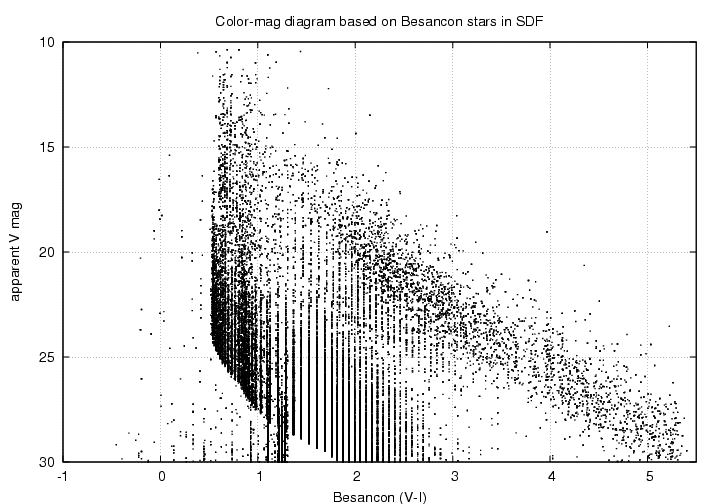
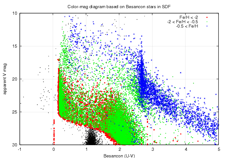
We can also plot the APPARENT V-band magnitude of stars against their color. The results will be smeared out, due to the varying distances of stars, but can be compared directly with the measurements.
Let's start with (U-B) on the horizontal axis again. This seems to me to be the most useful of the apparent-magnitude diagrams. I've used colors to show the metallicity of stars in the Besancon model in this diagram below. Note
The diagrams in the other colors seem less useful to me. Next is (B-V) on the horizontal axis. You can again see the high-metallicity = disk stars in the red side of the diagram, while low-metallicity stars dominate in the blue side. (I haven't color-coded them this time)
Finally, the diagram with (V-I) on the horizontal axis shows the same features.
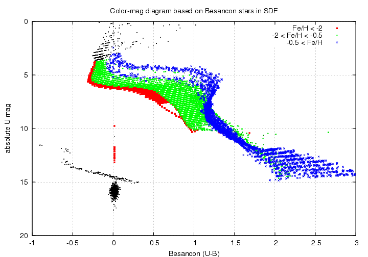
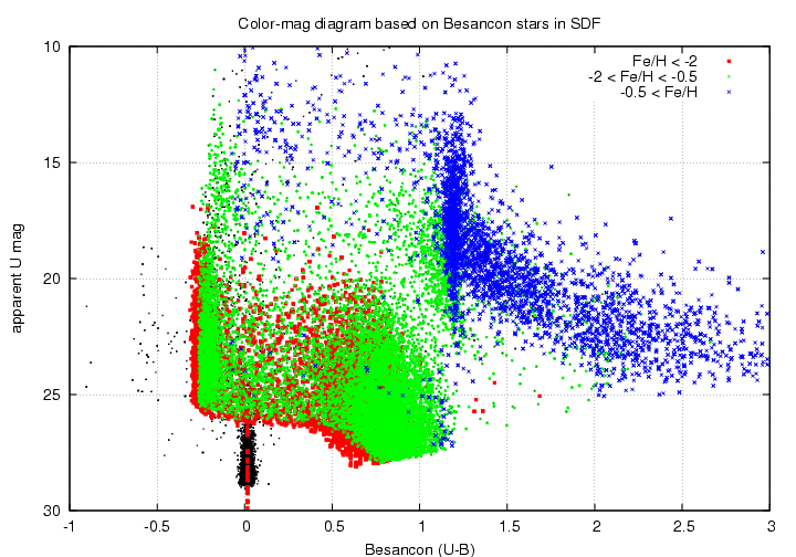
Since we have U-band data from another source, I made color-magnitude diagrams placing the U-band on the vertical axis, rather than V-band.
First, if we use the ABSOLUTE U-band magnitude on the vertical axis, we get this graph. Its features are pretty much the same as those in the version which has absolute V-band magnitudes on the vertical axis, so I won't repeat the descriptions.
Second, if we place APPARENT U-band magnitudes on the vertical axis, we get something that (again) looks very much like the version with V-band on the vertical axis. Again, read the comments in the previous section about the features one can see here.
Some of the B-band measurements in the SDF are not reliable. In some cases, it may be better to skip the B-band measurements and use other combinations of magnitudes. Below, I use (U-V) as a color.
First, the color-color diagram for (U-V) vs. (V-I). This is similar to other color-color diagrams; note the sharp bend in the DA white dwarf locus, the gradient in the wide part of the main sequence as a function of metallicity, and the narrow branch of low-metallicity stars turning up around (V-I) = 3.
The Hertzsprung-Russell-like diagram using (U-V) on the horizontal axis and absolute V on the vertical axis has no surprises, either. Note the halo WDs are a little less luminous than the disk WDs at a similar (U-V) color.

Finally, we can place the APPARENT V-band magnitude on the vertical scale. We see the same sharp edges mentioned in earlier sections.
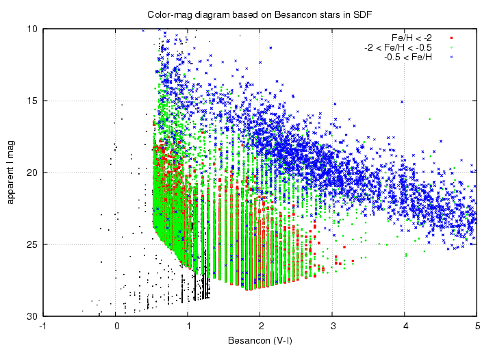
First, here's a copy of the apparent V vs. (V-I) graph, which appears in one the sections above, but this time done in color to code the metallicity of the stars.

Next, a graph with (U-V) on the horizontal axis, and APPARENT U-band magnitude on the vertical axis. This might make a good comparison for the real measurements.

Below is yet another color-magnitude diagram: this one places apparent I on the vertical axis; it might be useful since the Subaru i'-band measurements are often the most reliable.