 Copyright © Michael Richmond.
This work is licensed under a Creative Commons License.
Even though you are just starting to work on your raw data, it is time to start thinking about the final display of your results in the form of a poster. Your thoughts may suggest certain types of reduction or analysis that are best done at this early stage.
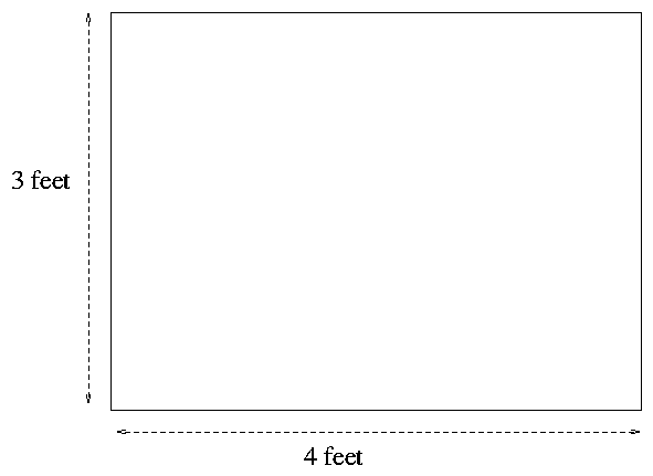
A standard poster is 4 feet wide by 3 feet high, but in this class, anything larger than 3 feet by 2 feet is acceptable.

Your goal is to convey to your audience the basic idea behind your project:
Who is going to be reading your poster? Random students and faculty walking through the College of Science. Most of them will know little about astronomy, telescopes, CCDs, or image analysis. You will have to
This can be a delicate balancing act. On the one hand, your poster needs some pizzazz in order to make a passing student take a second look at it. On the other hand, all style and no substance will leave the viewer with an empty feeling, like a dinner of Twinkies. There needs to be a reasonable amount of science mixed in with the eye-candy.
Consider ways to make your work more visibly appealing:
           Good                      Better
   -------------------          ------------------------------
      graphs                      graphs with color highlights

      images                      big images
                                  images with bold captions
                                  images with labelled features

      title                       big, bold title

      text                        text in moderate chunks
                                  text with bold headings

      telling what worked         telling what worked and what DIDN'T work
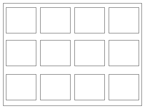
Lots of posters these days are simply Powerpoint presentations plastered in a big piece of paper:

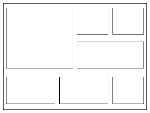
I don't like this format: no single unit is large enough to capture the eye. It's okay to place your work on a grid, but break it up with some large and some small pieces:

There are many web sites which provide good advice in making an effective poster. The list below is not exhaustive by any means.
 Copyright © Michael Richmond.
This work is licensed under a Creative Commons License.