 Copyright © Michael Richmond.
This work is licensed under a Creative Commons License.
Copyright © Michael Richmond.
This work is licensed under a Creative Commons License.
Using individual pairs of measurements is bad, and here's why.
Suppose your data show this:
      mass added   Force      distance stretched         derived k
        (kg)        (N)            (m)                     (N/m)
    -----------------------------------------------------------------
        0.005      0.049          0.081                    0.61
	0.010      0.098          0.125                    0.78
	0.015      0.147          0.169                    0.87
	0.020      0.196          0.214                    0.92
The values of k derived from each individual pair of measurements are definitely not the same. There's a clear trend. Should you just take the average, and say k = 0.80 N/m? Should you also say that "this spring does not obey Hooke's Law, because the value of k isn't the same for each measurement?"
No!
If you were to make a graph of this data, you would see it looks like this:
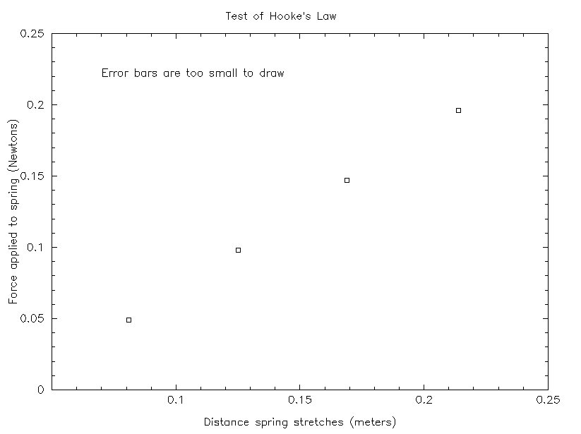
If you look at this graph, it's clear that the data DOES lie on a nice, straight line. So this method of analysis DOES imply that the spring obeys Hooke's Law. Moreover, the graph's slope yields a value of k = 1.1 N/m, which is different than ANY of the individual values of k derived from individual measurements.
What's going on?
Copyright © Michael Richmond.
This work is licensed under a Creative Commons License.