 Copyright © Michael Richmond.
This work is licensed under a Creative Commons License.
Copyright © Michael Richmond.
This work is licensed under a Creative Commons License.
If you wish to print a full-sized poster of your work, you must provide the instructor with a PDF file and an 8.5x11-inch hardcopy of your poster by Wed, Apr 22.
On Wed, Apr 29, each group will do the following:
It is possible that some groups may be discussing the same target. It would be a really, really good idea for those groups to coordinate their efforts, so that together they discuss a wider range of topics than either group could do by itself. After all, two posters have more area than one.
Each group will receive a grade which is based in part on the poster, and in part on the presentation. These scores will be a significant portion of each student's overall grade.
Let's focus today on the visual portion of your project: the poster. If your poster is judged to be worthy, we may print it out and hang it up in the hallway of Gosnell or Carlson.
Even though you are just starting to work on your raw data, it is time to start thinking about the final display of your results in the form of a poster. Your thoughts may suggest certain types of reduction or analysis that are best done at this early stage.
A standard poster is 4 feet wide by 3 feet high; in this class, you must make your poster have a width of one of the following:
![]()
Your goal is to convey to your audience the basic idea behind your project:
Who is going to be reading your poster? The primary audience will be other students in this class, of course. However, your poster may go up on the walls of Gosnell, in which case random students and faculty walking through the College of Science. Most of them will know little about astronomy, telescopes, CCDs, or image analysis. You will have to
This can be a delicate balancing act. On the one hand, your poster needs some pizzazz in order to make a passing student take a second look at it. On the other hand, all style and no substance will leave the viewer with an empty feeling, like a dinner of Twinkies. There needs to be a reasonable amount of science mixed in with the eye-candy.
Consider ways to make your work more visibly appealing:
           Good                      Better
   -------------------          ------------------------------
      graphs                      graphs with color highlights

      images                      big images
                                  images with bold captions
                                  images with labelled features

      title                       big, bold title

      text                        text in moderate chunks
                                  text with bold headings

      telling what worked         telling what worked and what DIDN'T work
Lots of posters these days are simply Powerpoint presentations plastered in a big piece of paper:
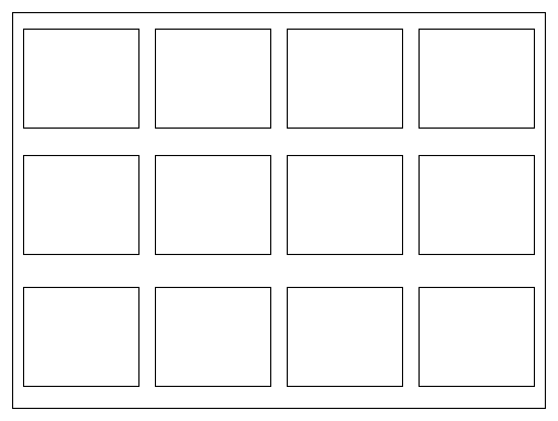
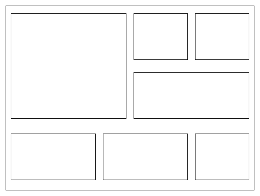
I don't like this format: no single unit is large enough to capture the eye. It's okay to place your work on a grid, but break it up with some large and some small pieces:
You may use any tool you wish to design and build your poster, but when you've finished, make sure to export it in PDF format. That's the version we'll send to the printer.
There are many web sites which provide good advice in making an effective poster. The list below is not exhaustive by any means.
Here are some examples of posters made by students in other classes I have taught:
Copyright © Michael Richmond.
This work is licensed under a Creative Commons License.