 Copyright © Michael Richmond.
This work is licensed under a Creative Commons License.
Copyright © Michael Richmond.
This work is licensed under a Creative Commons License.
Today's lab exercise should be carried out in pairs, ideally, but it's okay to do it by yourself or in a group of three.
In order to gain credit for this exercise, you must create a PDF document which provides the answers to all the questions and items written in red. Submit the PDF to the instructor via the "Assignments" tab in myCourses.
In order to carry out the tasks in this exercise, you will need several tools:
You may use a spreadsheet of some sort, or you may try one of a large number of programs designed for the analysis of datasets. Some students can make very nice plots using Python and matplotlib. I prefer to use this tool:
You will eventually use our telescopes and cameras to take a set of images of your target star on one or two nights. There will be LOT of images -- maybe 100 to 400. You'll use a program called AstroImageJ to display and process these images, and then to measure the brightness of stars in those images. At the end of the work, you'll have a big datafile with many, many columns of numbers.
Today, we'll practice on a much simpler dataset. The files you will use as input for your work are plain ASCII text files with a format like this:
# measurements of the intensity of three stars
# JulianDay             A           B           C
#
2459610.00000     1011.01      835.21      166.78
2459610.00139      997.21      861.85      150.97
2459610.00278     1005.10      855.06      174.02
2459610.00417      995.70      858.74      162.25
There are four columns: the first records the time when the image was taken, in the form of a Julian Date. The good news is that using Julian Dates to keep track of time makes many calculations convenient -- the number just increases by 1 for every day that passes. We don't have to remember how many days are in September, or how to handle leap years. The bad news is that Julian Day values are large numbers, so they can sometimes look awkward on graphs.
The following columns are simply measures of the brightness of three stars, in INTENSITY units. In other words, something like "how many photons from this star struck the camera during the exposure?" If star A is twice as bright as star B, then its intensity value in this datafile will be twice as large. Simple.
Here's a link to the first datafile you will analyze today.
				 Star            mean intensity     stdev of intensity
		  -----------------------------------------------------------
				  A                  997.6                 31.8
				  B                  550.6                 23.7
				  C                  160.0                 12.8
		  -----------------------------------------------------------
Well, since the standard deviation of star A is largest, perhaps star A has the least-precise measurements. By this reasoning, since star C has the smallest standard deviation, it might be the most precisely measured.One might make a different (and better) argument -- see the next time we ask this question.
Your next job is to create a simple light curve. This is simply a graph showing the brightness of each star as a function of time. Create a single graph which has intensity on the Y-axis and time on the X-axis. On this graph, plot the measurements for each star, using dots/symbols for each measurement; do NOT connect the data with lines. Make sure that your graph clearly indicates which symbols belong to star A, B, and C.
The symbols for star C appear to have the smallest scatter around the average level, so it seems to be the most precisely measured star. Star A, on the other hand, seems to be the least precisely measured star.
The answers are the same: star C appears to be the most precisely measured.(But keep an open mind ... and keep reading!)
When astronomers want to compare their results, they convert optical measurements to magnitudes. There are many steps involved in this procedure, but we'll look at a simplified version for this exercise. You will convert each measurement of intensity into an instrumental magnitude using the following equation:
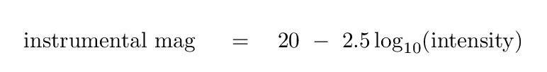
Use this equation to convert all the measurements of intensity into instrumental magnitudes. Then, use those magnitude values in the following steps:
				 Star            mean mag      stdev of mag
		  -----------------------------------------------------------
				  A               12.503          0.035
				  B               13.149          0.047
				  C               14.493          0.087
		  -----------------------------------------------------------
In this case, the standard deviation of the brigtness, expressed in magnitudes, has the smallest value for star A. Therefore, star A now seems to be the most precisely measured star.
Your next job is to create another light curve. This time, however, instead of placing intensity on the Y-axis, you must plot the instrumental magnitude values on the Y-axis.
In order to put the brightest star at the top of the graph (for easy comparison with the intensity graph), you will need to REVERSE the order of the Y-axis: large magnitude values should appear at the BOTTOM of the graph, and small magnitude values at the TOP.
The bright star A now appears to be measured most precisely, and the faint star C now appears least precisely measured.
This answer is the opposite to my answer for question D, but the same as my answer for question G.
At this point, you may be a bit puzzled -- just what is the right way to estimate the precision of a measurement? Or, to put it another way, how can we really determine the uncertainty in a measurement, or a series of measurements?
One very good way to compare uncertainties is to put them into a relative form. Instead of talking about the actual value of standard deviation in the intensity of a star, one might express it in PERCENTAGE terms. In other words, one might compute
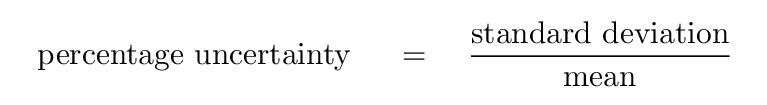
    Star    mean intensity     stdev of intensity     percent uncertainty
  -------------------------------------------------------------------------
     A         997.6              31.8                  3.2 %
     B         550.6              23.7                  4.3 %
     C         160.0              12.8                  8.0 %
  -------------------------------------------------------------------------
The uncertainties in magnitudes appear very close to the percentage uncertainty in the intensities. That turns out to be nice, convenient coincidence that astronomers can use to their advantage.
Using magnitudes causes the percentage uncertainties -- which are meaningful measures of the precision of a measured value -- to appear on a graph. For that reason, light curves made with magnitudes, instead of intensities, are probably more useful in most situations.
Copyright © Michael Richmond.
This work is licensed under a Creative Commons License.

