 Copyright © Michael Richmond.
This work is licensed under a Creative Commons License.
Copyright © Michael Richmond.
This work is licensed under a Creative Commons License.
It will be necessary to make graphs of the spectra of different stars to study them. Please practice doing so before we meet for class, so you'll know the procedure.
Below are a datafile taken from A Stellar Spectral Flux Library: 1150 - 25000 A by A. J. Pickles PASP 110, 863 (1998). The file provides the spectrum from a (model) star in simple ASCII text, with multiple columns. The first column lists the wavelength, and the second column the intensity of radiation.
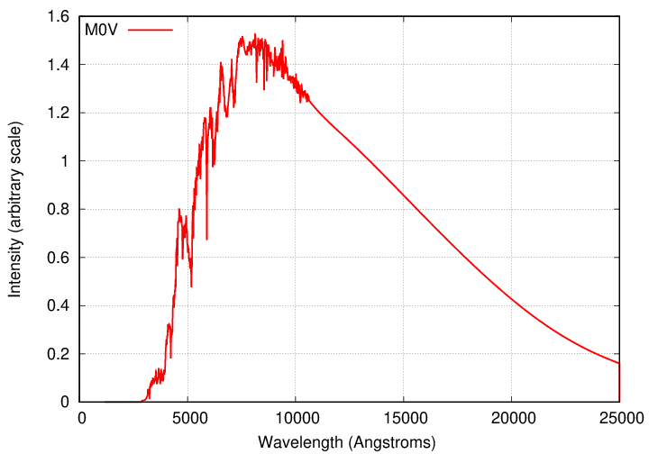
Your job is find a way to make a graph showing the intensity as a function of wavelength. There are many ways to create digital graphics; some people use Python's matplotlib, others (myself included) prefer Gnuplot. Find a method that works for you, and use it to make a graph for the above spectrum. For example, for an M0V star, a graph of the full datafile should look like this:
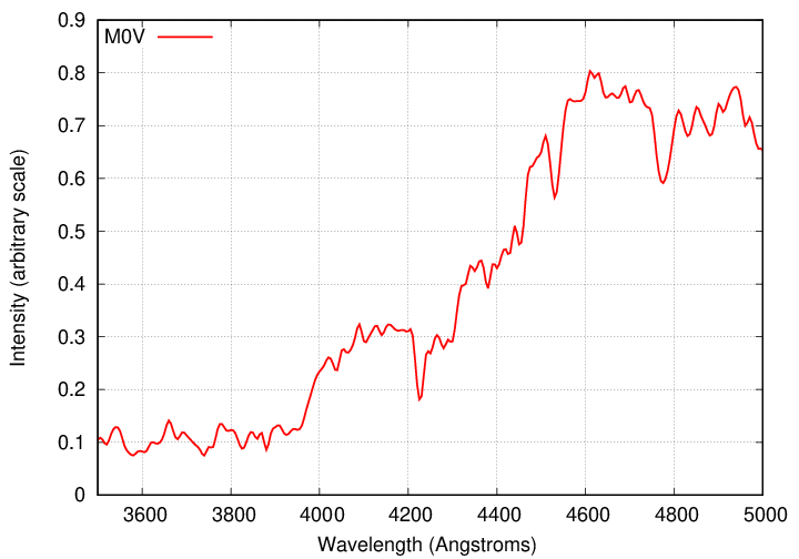
We're going to focus on the blue portion of the optical part of the spectrum, from 3700 to 5000 Å, since that region has many strong lines, and was also the region used primarily by the women who compiled the Henry Draper catalog and created the OBAFGKM system. So, please restrict your graph to these wavelengths. For an M0V star, the result looks like this:
So, please make a graph of this A0V star's spectrum, between the wavelengths of 3700 and 5000 Å.
If you do this at home, save all the work on your computer, and bring that computer to class, you should be able to make graphs for OTHER datafiles quickly and easily -- right?
Copyright © Michael Richmond.
This work is licensed under a Creative Commons License.