 Copyright © Michael Richmond.
This work is licensed under a Creative Commons License.
You can use Scilab not only to calculate quantites, but to plot them as well. In this course, we'll do only simple x-y plots. It's easiest to explain through examples.
To create a simple plot of a quantity y versus another quantity x,
It's often simplest to create an array of x values using Scilab's "implicit for loop". The statement
x = 0 : 0.1 : 10;
creates an array which starts at 0, ends at 10, and
increases by 0.1 at each step.
Thus, it looks like
0, 0.1, 0.2, 0.3, .... , 9.8, 9.9, 10
In most cases, when you call a function with an array as an argument, the function will be applied to each element of the array individually, and the results stored in an output array of the same size. Thus, if the function plusone adds 1.0 to its argument, then
y = plusone(x);
will yield an array y which looks like this:
1, 1.1, 1.2, 1.3, .... , 10.8, 10.9, 11
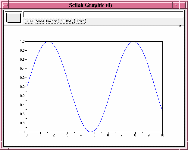
Once you have two arrays of the same size, you can plot one against the other via the plot command.
For example,
--> x = 0 : 0.1 : 10;
--> y = sin(x);
--> plot(x, y);
creates a window which looks like this:

There are a number of options to the plot command, which you can read by typing help plot in the Scilab Control Window. Let me give two examples.
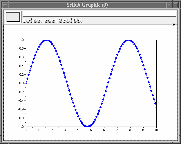
First, I can plot individual points together with a connected line:
--> x = 0 : 0.1 : 10;
--> y = sin(x);
--> plot(x, y, 'o');
creates a window which looks like this:
Second, I can plot several different sets of data together:
--> x = 0 : 0.1 : 10;
--> y = sin(x);
--> z = cos(x);
--> plot(x, y, x, z);
creates a window which looks like this:

Other useful plot-related functions
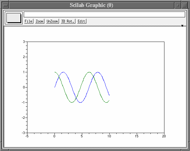
Another useful command is mtlb_axis, which lets you control the size of the axes. If I've already created the plot with both sine and cosine functions, I can resize it by typing
EDU>> mtlb_axis([-5, 15, -3, 3]);which changes the plotting window so it looks like this:
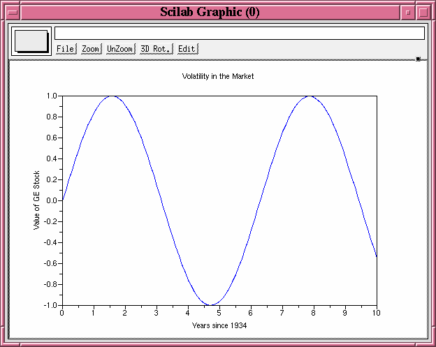
To put labels on your graph, you can call the xlabel, ylabel and title commands:
EDU>> xlabel ('Time since 1934');
EDU>> ylabel ('Value of GE Stock');
EDU>> title ('Volatility in the Market');
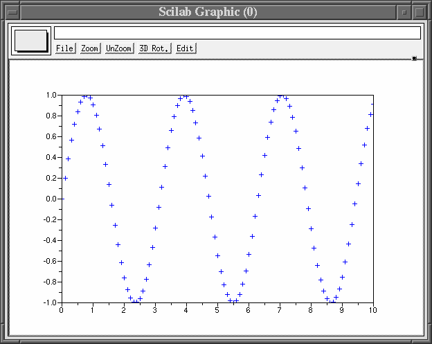
Finally, the clf command allows you to control whether each plotting command draws on top of the existing graph, or clears the window before drawing. Look at the difference between this:
edu>> x = 0 : 0.1 : 10;
edu>> y = sin(x);
edu>> z = sin(2*x);
edu>> plot(x, y);
edu>> plot(x, z, '+');
which superimposes all the data
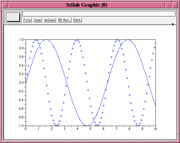
and this sequence, which uses the clf command to wipe the graphics window clean after the first graph has been displayed.
edu>> x = 0 : 0.1 : 10;
edu>> y = sin(x);
edu>> z = sin(2*x);
edu>> plot(x, y);
edu>> clf;
edu>> plot(x, z, '+');
Last modified by MWR, Mar 6, 2007.
 Copyright © Michael Richmond.
This work is licensed under a Creative Commons License.