 Copyright © Michael Richmond.
This work is licensed under a Creative Commons License.
Copyright © Michael Richmond.
This work is licensed under a Creative Commons License.
Scientists and artists can use colors to hide or reveal features in a picture -- what you see on the screen (or the paper) is not always the same thing you would see with your eyes. Astronomical objects are very often shown in some "modified" way in order to emphasize certain details. Viewer beware!
One trick that photographers can do in this age of Photoshop and gimp is to "turn up the volume" on the colors of an image. In other words, while leaving the color of the colors unchanged (did that make sense?), change the saturation level of the image.
Look at these four versions of a photograph, for example. The grass is always green, but by fiddling with the saturation level, we can make it MORE GREEN.
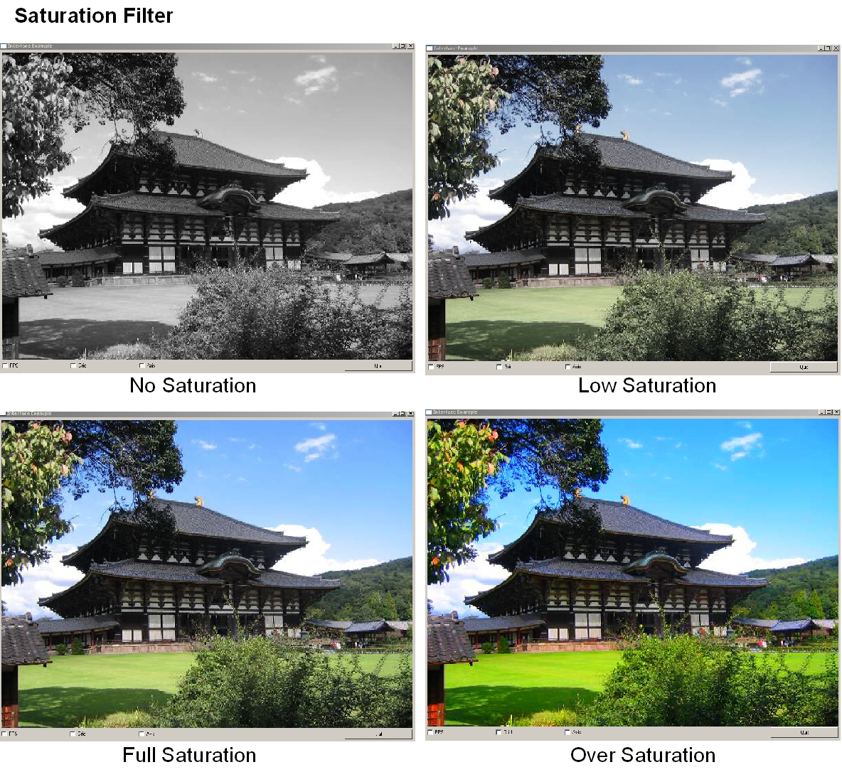
Image courtesy of
SoME Gurus
Astronomers can use this effect to make more visible the very subtle variations in the light reflected from the Moon. Click on the picture of the Moon below to see how super-saturating the colors can bring out subtle details.
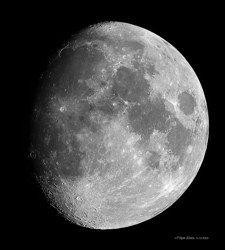
Image taken from
Filipe Alves' excellent site!
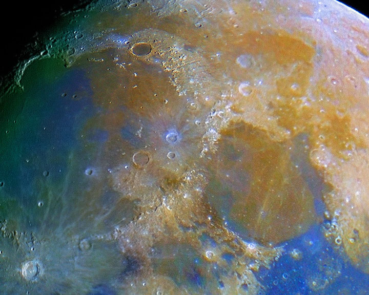
Image taken from
Filipe Alves' excellent site!
Geologists who study the surface of Mars using images taken by the Mars Exploration Rovers do the same thing. The rovers' Pancam has a set of seven filters which slice the range of visible light into narrow sections:
If one looks at a true-color version of the martian surface, one sees, basically, orange:
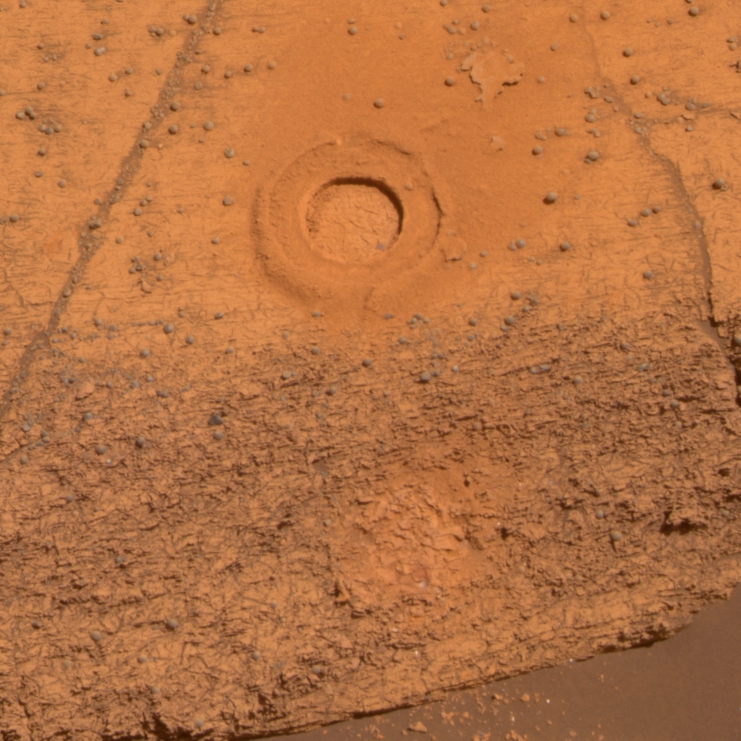
Image from Opportunity sol 314 from
Pancam team true-color pages
But by combining images taken through just 3 of the 7 filters ( read this article for more details on the filters ), one can enhance small changes in color which reveal differences in the minerals.
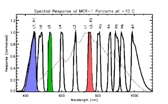
Figure taken from
Mars Exploration Rover Athena Panchromatic Camera (Pancam)
investigation
  filter     wavelength     really appears    in enhanced image
 --------------------------------------------------------
   L7         440 nm         blue                 blue
   L5         535 nm         green                green
   L2         753 nm         deep red             red
 --------------------------------------------------------
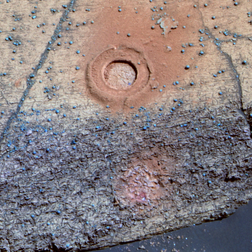
Image from Opportunity sol 314 from
Pancam team false-color pages
In this image, for example, we can see that when the rover's grinding tool made the shallow circular hole in the middle of the image, the dust it created was reddish; but the small, hard little balls of minerals which have eroded out of the rock are relatively blue. In fact, these objects are called blueberries by some scientists, and are actually spherules rich in a mineral called hematite, which is a sign that they may have been deposited long ago in a water-rich environment.
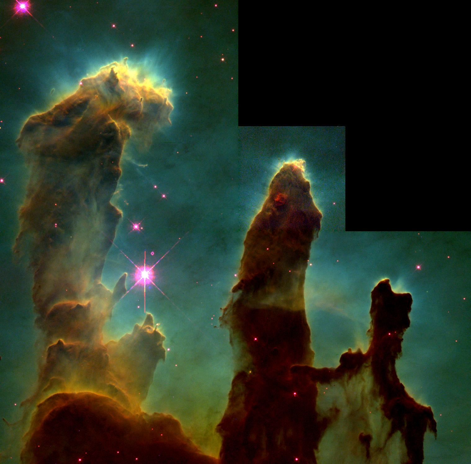
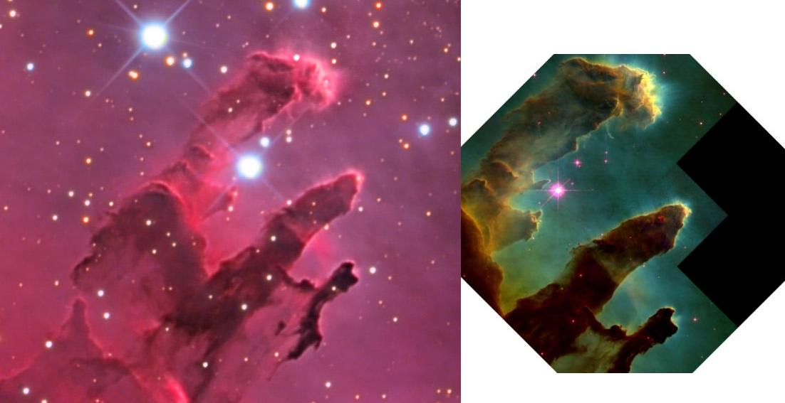
Here's a famous example: a closeup of the Eagle Nebula, as seen by HST:
Thanks to
the HST Gallery
But wait ... if we look at a wide-angle picture of this same nebula taken with a telescope on the ground, we see some very different colors:
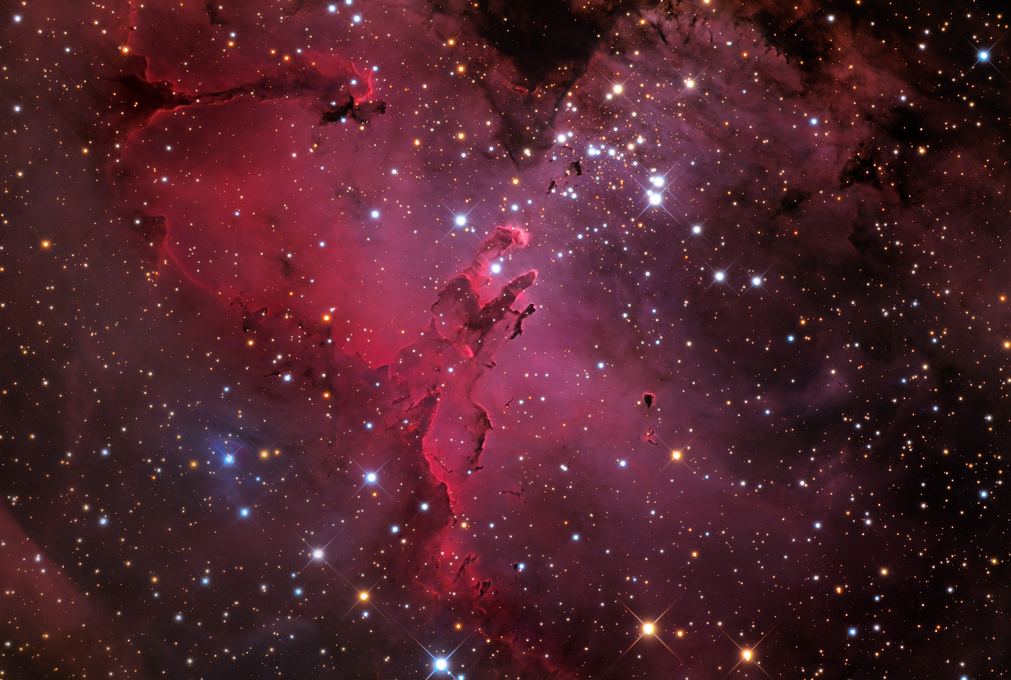
Image courtesy of the University of Arizona
What's going on here?
The HST picture is an example of "false-color" imaging, while the ground-based picture is closer to what you might see if you looked with your own eyes. The astronomers who requested the HST image used a set of three very narrow filters which transmit light of just a few special wavelengths.
Thanks very much to
the Starizona Guide to CCD Imaging
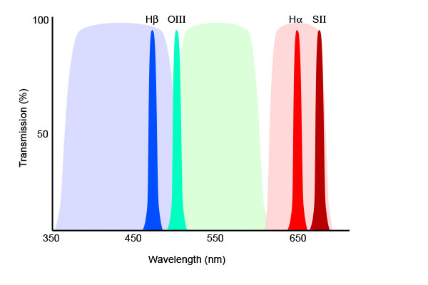
The three filters were
   Wavelength            light emitted by
 --------------------------------------------------------
    500.7 nm            OIII     (doubly-ionized oxygen)
    656.3 nm            H-alpha  (neutral hydrogen)
    672.4 nm            SII      (singly-ionized sulfer)
 --------------------------------------------------------
Since each of these three particles will emit light under a slightly different set of circumstances, using these narrow-band filters allows astronomers to figure out which portions of the nebula are more or less dense, hotter or cooler. It's a very effective way to "see" properties of the gas such as temperature, pressure, or density.
However, those tricksy astronomers did not combine these three images in the manner you might expect. Instead, they "colored in" their three narrow-band images with the following colors:
   Wavelength     really appears      in HST picture
 --------------------------------------------------------
    500.7 nm         green               blue
    656.3 nm         deep red            green
    672.4 nm         deeper red          red
 --------------------------------------------------------
The resulting image looks quite different from the "natural" one. However, the strongly changing colors in the false-color version allow scientists to figure out which portions of the cloud are denser or hotter than other sections. The simple "realistic" version on the left doesn't show any of those fine details -- it's all just red.
The false-color version also shows that some of the stars in the middle and lower pillars are embedded inside the gas clouds: their very red colors indicate that the light from those stars is passing through a lot of dust before it reaches our eyes, just like the light from a sunset:
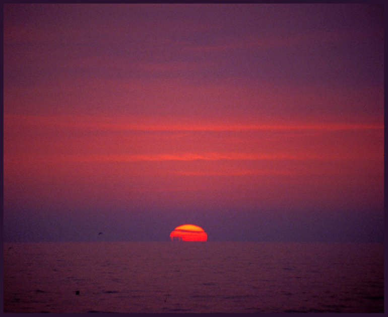
Image copyright
Jurgen DP
The idea of assigning the Red, Green and Blue portions of an image to arbitrary wavelengths can be taken one step farther. We can choose wavelengths which would be completely invisible to human eyes! In other words, we can use a special camera to take pictures of, say, infrared light, and then use our regular "Red" crayon to color in that picture.
For example, consider this dark cloud in our Milky Way Galaxy, called "Barnard 68". The cloud sits in front of a rich background of stars, blocking our view of the stars behind it. You can just barely see a few stars around the edge of the cloud: they look red because the dust in the cloud scatters blue light more than red light.
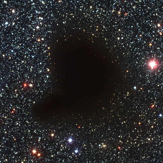
Image courtesy of
the European Southern Observatory
Astronomers used the SOFI infrared camera on the NTT 3.5-m telescope in Chile to take a series of pictures at infrared wavelengths.
   Filter   Wavelength     really appears    in picture
 --------------------------------------------------------
    J       1250 nm         invisible           blue
    H       1650 nm         invisible           green
    K       2160 nm         invisible           red
 --------------------------------------------------------
Note that this false-color scheme follows a familiar pattern: the shortest wavelengths are assigned to the "blue" crayon, and the longest wavelengths are assigned to the "red" crayon. Astronomers follow this convention most of the time.
Since infrared light can penetrate dust much better than visible light, these infrared images show many of the stars which are behind the cloud. Click on the image below to see a comparison of the visible and false-color infrared pictures.

Because astronomers used the familiar "red = long wavelength" convention, even in the false-color picture, the stars which were directly behind the cloud looked reddish -- similar to the appearance of the stars around the edges of the cloud in the visible-light photograph.
Combining visible and infrared wavelengths of light seems reasonable: we can use very similar telescopes and cameras to capture visible and infrared light. Many astronomical objects appear at least roughly the same in the visible and infrared. But why stop there?
We can use images taken at wavelengths far from the visible and still create a picture that we can see with our eyes. For example, the Chandra X-ray satellite detects photons of very short wavelengths: instead of hundreds of nanometers, its photons have wavelengths of a few nanometers. But that doesn't stop us from assigning our red, green and blue crayons to these X-rays.
      Wavelength     really appears    in picture
 ---------------------------------------------------
   0.2 - 0.3 nm      so very invisible   blue
   0.5 - 0.8 nm      very invisible      green
   0.8 - 2.5 nm      invisible           red
 ---------------------------------------------------
The picture below shows the gas cloud expanding from the site of a supernova which exploded roughly 320 years ago.
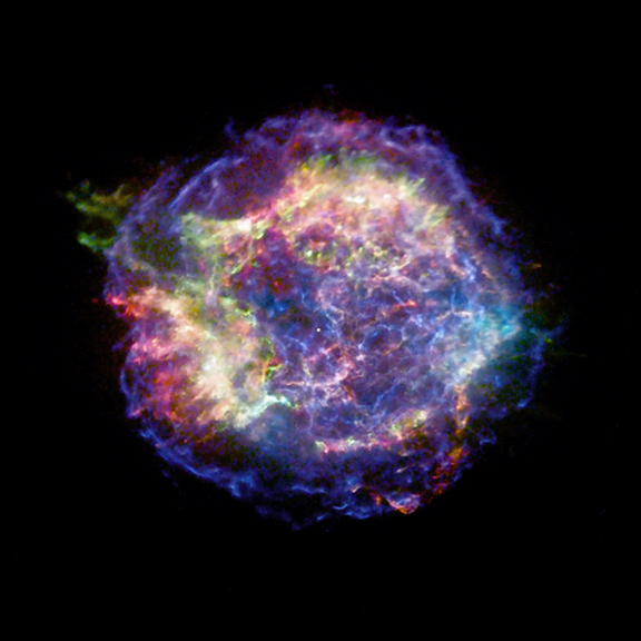
Image courtesy of
Chandra Image Gallery
In this case, the blue regions -- from which the highest-energy X-rays originate -- delineate shock waves at the outermost edges of an expanding shell of gas. The green and red portions of the nebula, which produce lower-energy X-rays, indicate gas which has been heated by the passage of the shock wave and is now cooling down. Using colors makes it easier for astronomers to see the dynamics of gas in this supernova remnant.
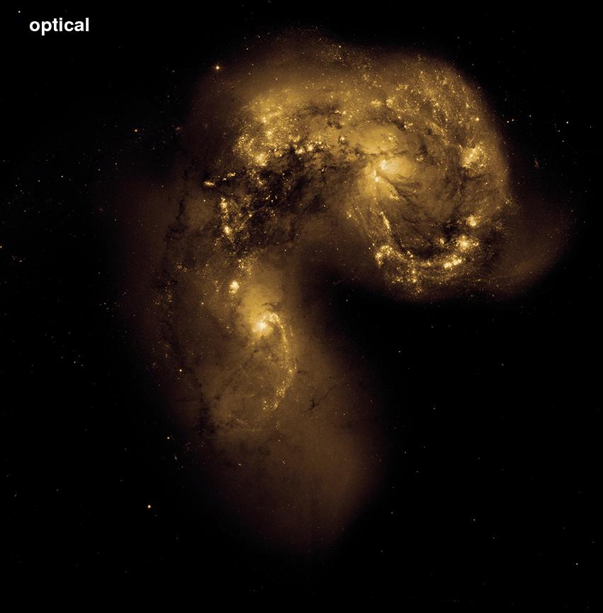
The "Antennae" are a pair of galaxies which appear to be colliding with each other. In this optical image, one can see long tails of stars which have been pulled out of each galaxy by their gravitational forces during the collision:
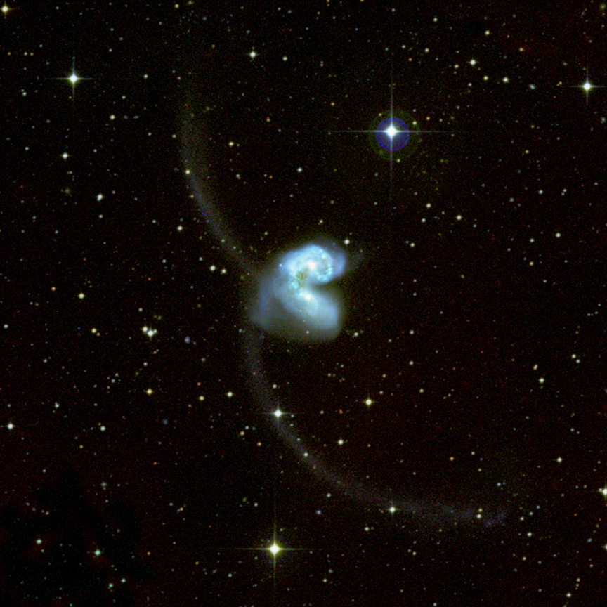
Thanks to
the Chandra Gallery
Let's zoom in a bit and examine the situation using several different types of telescopes. If we look in the optical (with HST), we see clusters of hot, young stars scattered throughout two diffuse globs of starlight.
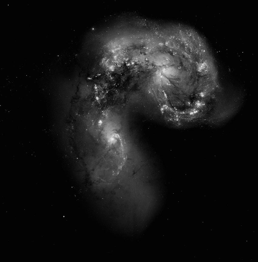
Thanks to
the Chandra Gallery
If we look in the infrared (with the Spitzer Space Telescope), we see the gentle glow of dust clouds which have been warmed by the surrounding starlight.
Thanks to
the Chandra Gallery
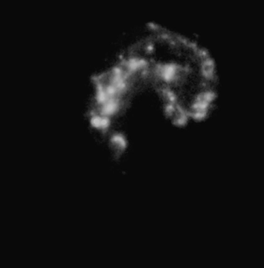
If we use the Chandra X-ray telescope to look at very high-energy radiation, we see a faint diffuse glow due to very hot gas, but also a large number of point sources. These bright dots are caused by gas spiralling into black holes and onto neutron stars, showing places where massive stars lived briefly before blowing up in supernova explosions.
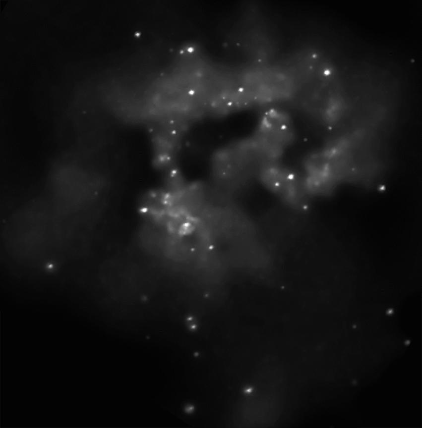
Thanks to
the Chandra Gallery
If we put all this information together in one image, we can see at a glance the connections between the structures which make up these colliding galaxies.
Another example combines optical and radio data. The galaxy NGC4449 is a relatively small one, a dwarf galaxy with a number of relatively young stars mixed in with a bunch of old ones. This HST image shows the stars clearly.
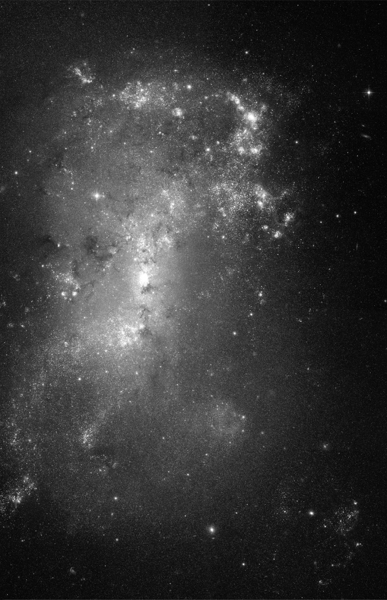
Image courtesy of Astronomy Picture of the Day and Hubble Heritage
The Very Large Array radio telescope has also observed this galaxy. Ordinary stars don't emit radio waves, so its picture doesn't show them. However, the radio telescope is very sensitive to hydrogen gas which has been excited by hot stars nearby. If we combine the two types of information into a single picture using false colors, we can see at a glance where most of the hot stars and gas is located.
      Wavelength        shows           in picture
 --------------------------------------------------------
       optical          stars            yellow
       radio            excited gas      blue
 --------------------------------------------------------
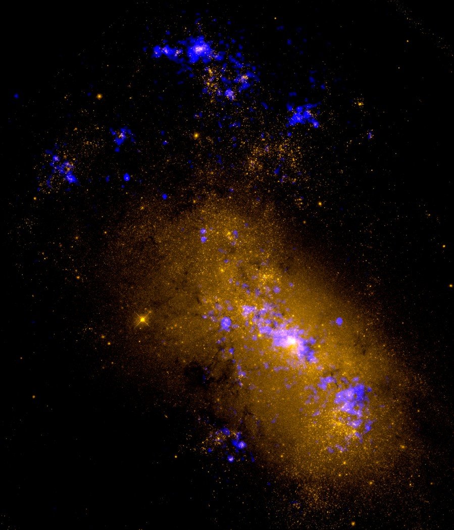
Image courtesy of
NRAO/AUI and Amy Reines, University of Virginia, NRAO/AUI the NRAO Image Gallery
Copyright © Michael Richmond.
This work is licensed under a Creative Commons License.