 Copyright © Michael Richmond.
This work is licensed under a Creative Commons License.
Copyright © Michael Richmond.
This work is licensed under a Creative Commons License.
Stars are created deep within giant molecular clouds. When we look at such regions, we often see not just one, but a whole bunch of stars forming together.
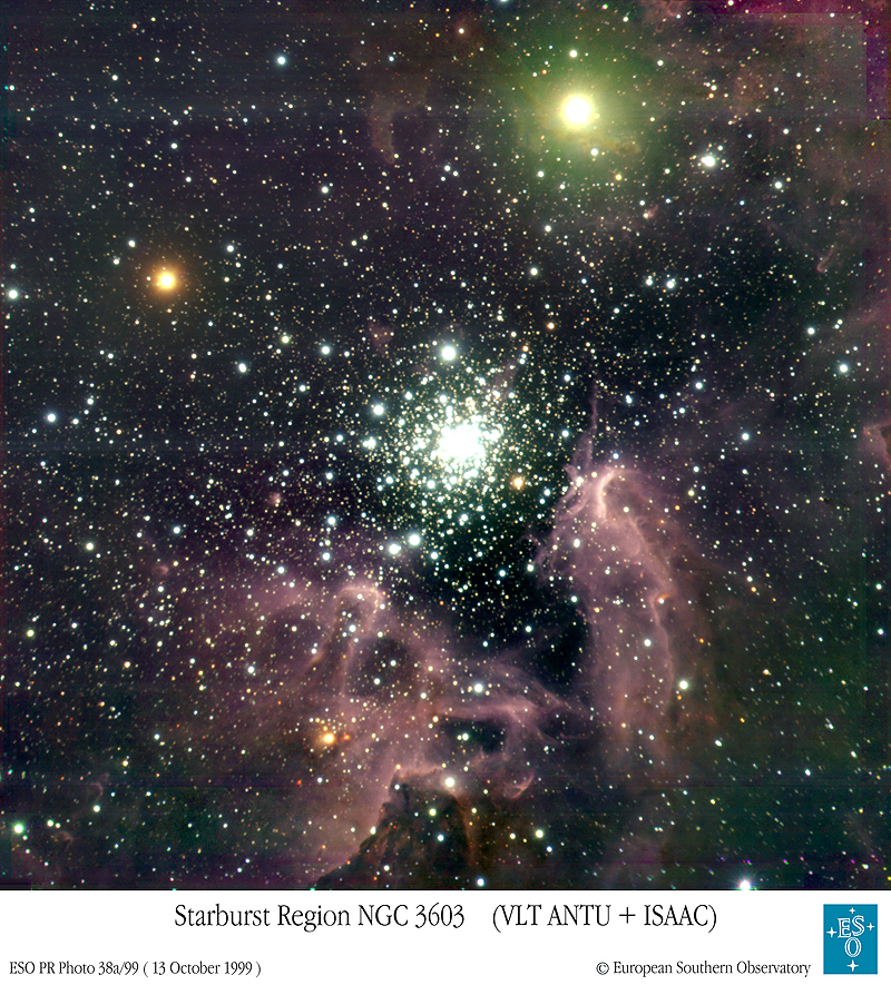
In fact, it seems that stars are usually born in big groups, as members of a cluster of stars. All the stars in the cluster form at about the same time. So, if we look at a cluster, we see a bunch of stars which are all roughly the same age. However, the stars do not all have the same mass: most tend to have masses less than the Sun's, but a few may be much more massive.
One reason to concentrate on clusters is the simple fact that all the stars are very nearly the same distance away from us. That means that their apparent brightness (or magnitude) is almost as good as their absolute brightness (or magnitude). That is, the stars in the cluster which appear to be brightest are really the most powerful; the stars in the cluster which appear to be dimmest are really emitting the least radiation. The difference between the apparent magnitude and the absolute magnitude, the so-called distance modulus, is the same for all the stars in the cluster. This means we can very easily compare the observed HR diagram of a cluster to a theoretical HR diagram, based on stellar models.
Q:  What happens if we try to compare the
    observed color-magnitude diagram (i.e. with apparent
    magnitudes, not absolute magnitudes) of a bunch of
    random stars to a
    theoretical HR diagram?
A random set of stars will not show any nice pattern, because their APPARENT magnitude isn't purely related to their luminosity; it also depends on distance.
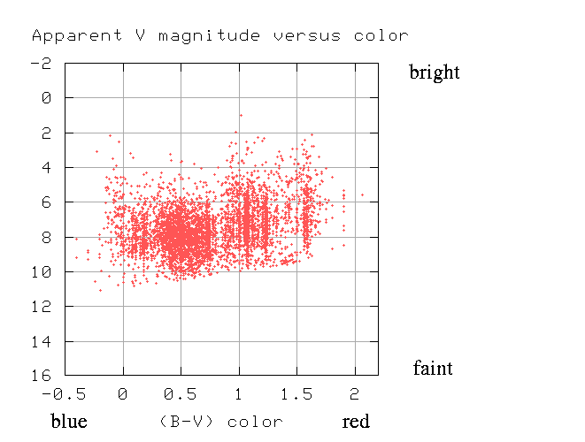
But if we pick a bunch of stars which are all at the same distance, then their APPARENT magnitude will, in fact, be proportional to their luminosity. If we put a star twice as luminous as the Sun right next to the Sun, it will always look twice as bright, no matter who looks at it, or where the observer is.
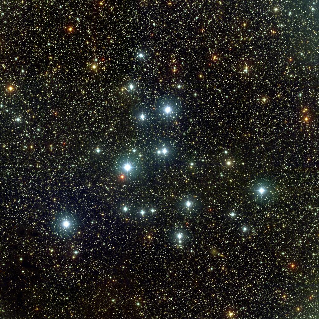
For example, if we look only at stars within the Pleiades cluster:
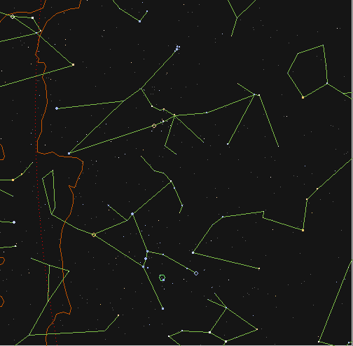
Click on picture to see constellation figures.

Credit and Copyright:
Robert Gendler
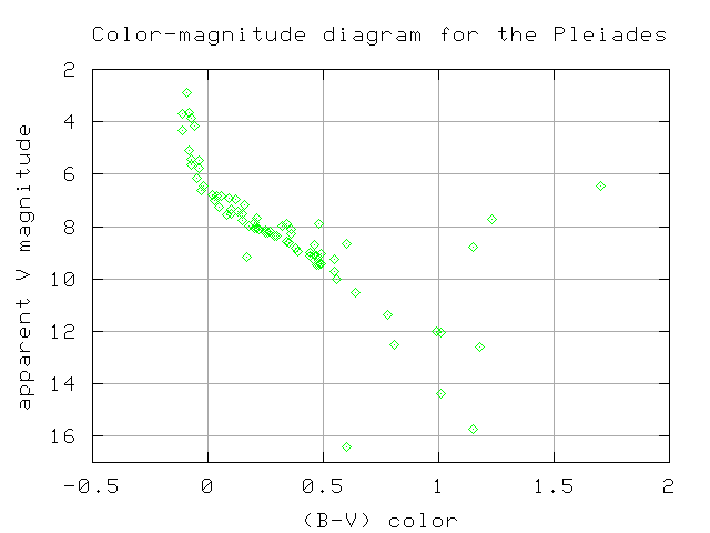
and measure the color and apparent magnitude of each star, we do find a nice pattern...
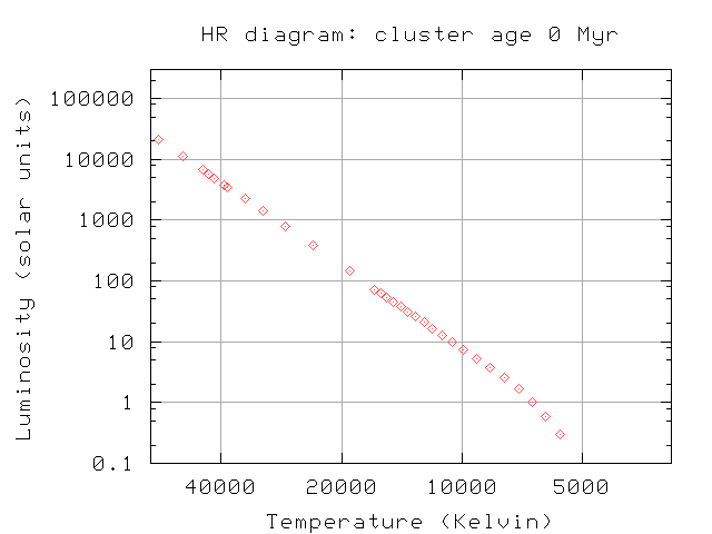
If we are lucky enough to find a cluster in which the stars have just started fusing hydrogen, we will see the mythical Zero Age Main Sequence, or ZAMS. It would look something like this:

There are very massive, hot, blue stars at the top-left of the HR diagram, as well as low-mass, cool, red stars at the bottom-right. Now, in real life, the stars in a giant molecular cloud don't all finish contracting and begin to fuse hydrogen simultaneously; there is always a small spread of several millions of years in age. But we expect to observe something like this for very young clusters.
As the cluster ages, the most massive stars go through the entire supply of hydrogen quickly, in just a few million years. Watch the upper portion of the HR diagram: there aren't many changes over 3 million years

but stars above 60 or 70 solar masses start to move off the main sequence, sliding towards the upper-right portion of the HR diagram.
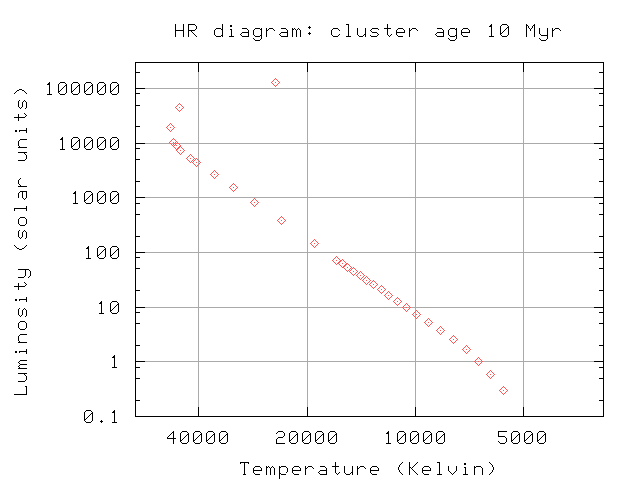
We call stars in the upper-right corner of the HR diagram red giants, because they are very cool and very large.
Q: How do we know that they are very large?
Red giant stars are no longer fusing hydrogen to helium in their cores. As we shall see soon, they have started to fuse helium nuclei into carbon.
If we continue to watch as the stars age, we see a gradual progression of stars from the main sequence to the red giant area. (Click on the graph below to see an animated version.)
If we believe our theoretical models of stellar evolution, then we can use these theoretical HR diagrams to determine the age of any particular cluster of stars. We simply compare the observed HR diagram to the theoretical diagram, paying special attention to the upper end of the main sequence. Here, for example, is the color-magnitude diagram for the Pleiades:
The main-sequence turnoff occurs at a color of about (B-V) = -0.1; that's blue, and means there are some massive, hot, powerful stars.
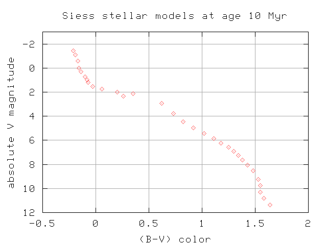
Now, if we look at a series of stellar models of different ages, we see that very young clusters include hotter, bluer, more powerful members:
whereas old clusters don't have any blue stars at all:
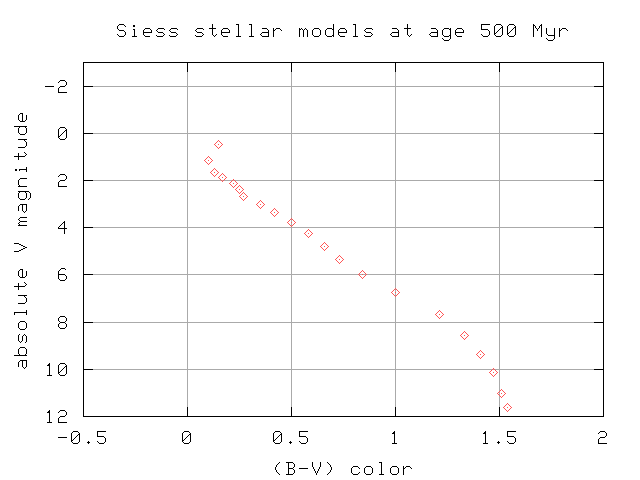
By plotting the observed colors and magnitudes together with theoretical models, and looking for the best match, we can estimate the age of the cluster.

Two different types of star clusters
Astronomers have been observing clusters of stars for centuries. Over the years, they noticed that most clusters fell into one of two categories. Some looked like this:
Taken from
APOD.
Copyright:
Heidi Schweiker,
WIYN,
NOAO,
AURA,
NSF
And others like this:
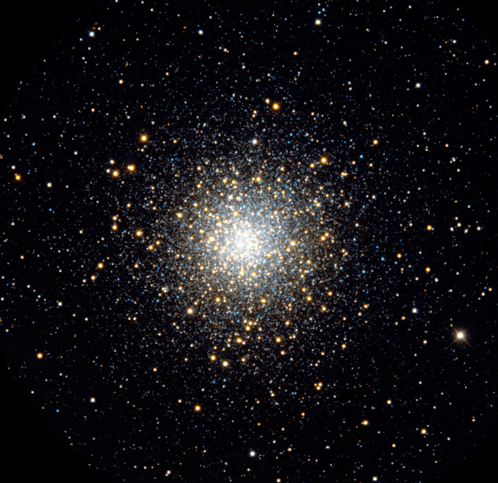
We have given the names open (or galactic) and globular to the two types of cluster.
                      open          globular
--------------------------------------------------
appearance           loose           compact

number of stars     20 - 1000    50,000 - 1,000,000

colors            mostly blue       mostly red

location         near Milky Way    all over sky
--------------------------------------------------
The HR diagrams of these two types are very, very different.

The V-band magnitudes of the stars in M53 have been shifted upwards by 8 in order to fit nicely on the same graph with the Pleiades.
Q:  Why are the two color-magnitude diagrams so different?
    Which cluster is older?
http://vizier.cfa.harvard.edu/viz-bin/VizieR?-source=J/AJ/116/1775/
They were originally published in CCD Photometry of the Globular Cluster M53. I. Color-Magnitude Data and Blue Straggler Stars by Rey, Soo-Chang; Lee, Young-Wook; Byun, Yong-Ik; and Chun, Mun-Suk.
Copyright © Michael Richmond.
This work is licensed under a Creative Commons License.