 Copyright © Michael Richmond.
This work is licensed under a Creative Commons License.
Copyright © Michael Richmond.
This work is licensed under a Creative Commons License.
Here are the measurements made in class:
#group  length  d_length   omega  d_omega
#       (m)      (m)      (rad/s)  (rad/s)
A       1.013   0.002      3.103   0.0103
A       0.0118  0.002      9.119   0.028
B       0.693   0.002      3.708   0.027
B       0.200   0.003      6.856   0.040
C       0.70    0.003      3.73    0.02
C       0.40    0.003      4.92    0.02
D       0.70    0.002      3.75    0.013
D       0.20    0.002      7.003   0.015
E       0.100   0.002      9.85    0.21
E       1.000   0.002      3.12    0.01
F       0.400   0.003      4.967   0.052
F       0.200   0.003      7.012   0.041
G       1.000   0.003      3.088   0.0042
G       0.10    0.002      9.807   0.0362
So, what can we learn from these measurements? If we make a graph in the proper manner, using
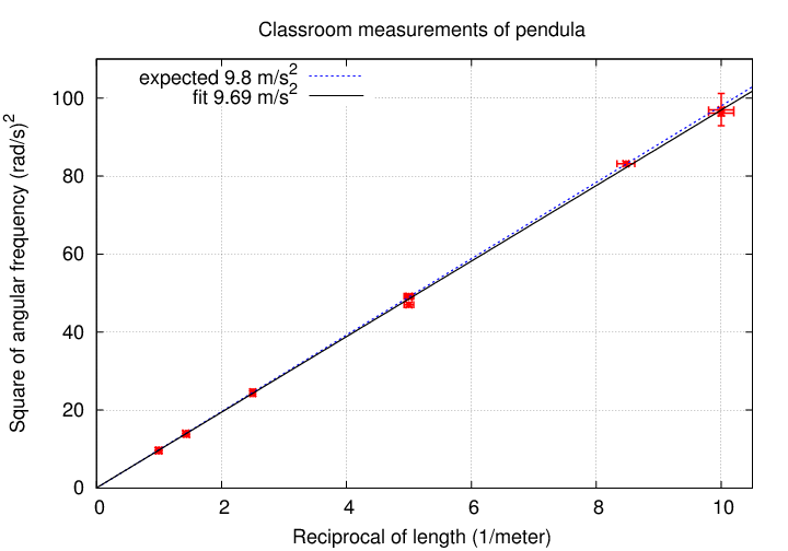
Hooray! The slope I measure from these data is 9.69 m/s^2, which is very close to the value we expect.
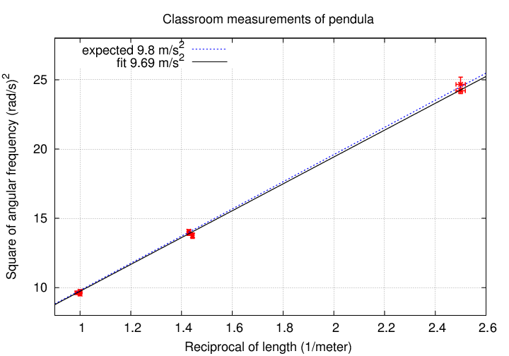
Now, each of the measurements had some uncertainty, so there are errorbars on all the symbols. Most are very small, so it's hard to see them. I'll zoom in on the first few points so that you can get a sense for the tiny size of these errorbars:
What is the uncertainty in this value of g? That depends on the uncertainty in the slope of the line.
   Q:  How does one estimate the uncertainty in the
       slope of a line fitted to a graph?
The answer is -- just tilt the line as much as you can while still going through all (or nearly all) of the symbols and errorbars. My own attempt yields an uncertainty of about +/- 0.25 m/s^2, but your value may be a bit different; that's fine.
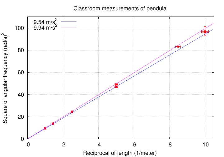
   Q:  Does the expected value of g fall
       within the range of slopes consistent with
       these measurements?
Copyright © Michael Richmond.
This work is licensed under a Creative Commons License.