 Copyright © Michael Richmond.
This work is licensed under a Creative Commons License.
Contents
We can learn quite a bit about exoplanets using some of the nice features of the NASA Exoplanet Archive. Today, we will we explore the demographics of exoplanetary systems via the graphing capabilities of the archive.
Let me show you how it's done. I'll pick two properties of exoplanets which are tabulated in the main Planetary Systems Composite Data table.
Orbital Semi-Major Axis vs. Orbital Period
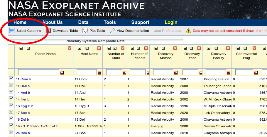
In order to select these two columns for further examination, I'll click on the "Select Columns" button of the table.

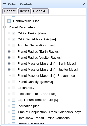
When a new window pops up, I'll clear all, then check the boxes for each of these two columns, then click on "Update".
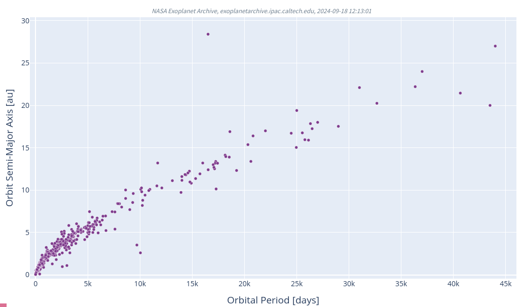
Next, I'll choose the "Plot Table" option, with Plot Currently Checked Columns, and click on Scatter Plot. After a bit of fiddling with the options, to put Period on the y-axis and Semi-Major Axis on the x-axis of the graph, and some zooming, the result is a plot showing the orbital semi-major axis of all the known exoplanets as a function of their orbital period (for those objects with known values of both parameters).
A log-log version of the graph looks a bit simpler.
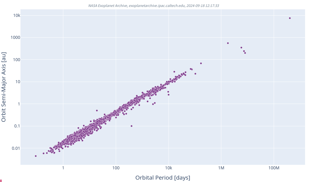
  Q1:  What does this graph tell us about the exoplanet systems
           that we have currently measured?
Let's try another combination of factors. Once again, starting in the Planetary Systems Composite Data table. Let's pick these two columns
Planet Mass (Jupiter mass) vs. Orbital Period
Please make your own graph of planet mass (log scale, on y-axis) against orbital period (log scale, on x-axis).
Your graph should look something like this:
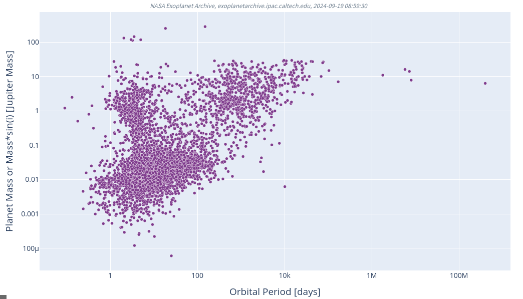
Q2: What can one learn from this graph?
Now, NASA's Exoplanet Archive is a wonderful resource, collecting information from thousands and thousands of papers and other sources, but -- as always -- it is important for the user to understand its limitations and hidden properties. It turns out that some of the information on the graph above is not directly measured, but instead is based on assumptions and reasonable guesses.
In particular, the MASS of a planet is not very easy to measure. In order to measure the mass directly, one must use the radial velocity technique to detect the tiny Doppler shift in the spectrum of its host star. Astronomers have not made this measurement for the majority of exoplanets we've discovered ... and yet the graph we made earlier shows symbols for nearly every object in the archive. How is that possible?
The answer can be found in one section of the NASA Exoplanet Archive's Documentation. Specifically, the webpage describing
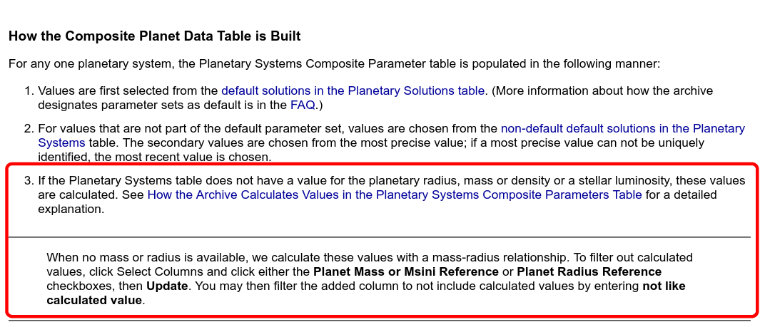
(*) Actually, one should use the
Planet Mass or Mass*sin(i) Provenance column
to weed out the planets for which a density has been assumed.
Set the filter to "not like relationship",
and check to make sure that the number of records shown in
the updated table is smaller than the full number.
If we include only those exoplanets for which we have made radial velocity measurements, and so can reliably estimate masses, we see a somewhat less densely populated version of the graph. (Click on the graph to compare the two versions)
When I compare these two versions of the plot, I can see that there are many exoplanets which do not yet have radial velocity measurements, and so do not yet have reliable estimates for their mass; but the major features of the two versions of the plots are basically the same.
Still, one should always be careful to read the fine print!
Okay, let's choose one more pair of planetary parameters to compare. This time, make a graph showing
Planet Radius (Earth) vs. Planet Mass (Earth)
with the radius (linear scale) on the y-axis and mass (log scale) on the x-axis.
Your graph should look like this.
     Q3:  There are two major clumps of objects: one near the middle bottom,
               and one near the top right.  What are these clumps?


  Bonus:  Why are there two long, curving features on this graph?
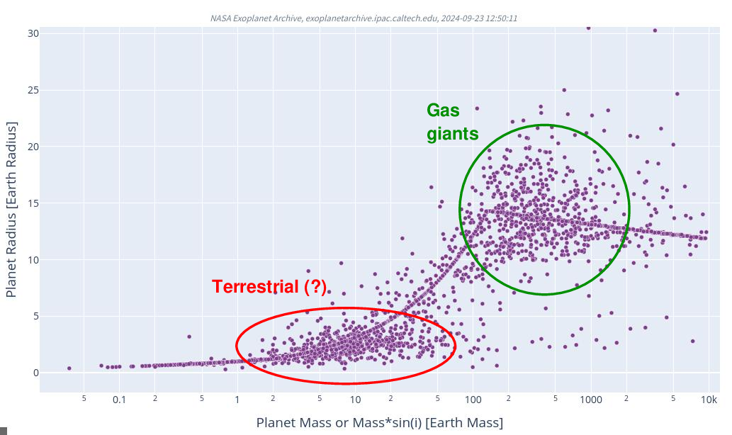
Now, the two curving lines in our graph are due to objects for which either the mass or radius was ESTIMATED, not measured. As explained earlier, in some cases, the NASA Exoplanet Archive uses an analytic formula to compute the mass from the radius, or vice versa. We can remove such objects from our sample by selecting the additional columns
and requiring that all the following conditions are met:
If we include only the exoplanets with proper measurements of both mass and radius, we see a graph without those thin, curving lines.
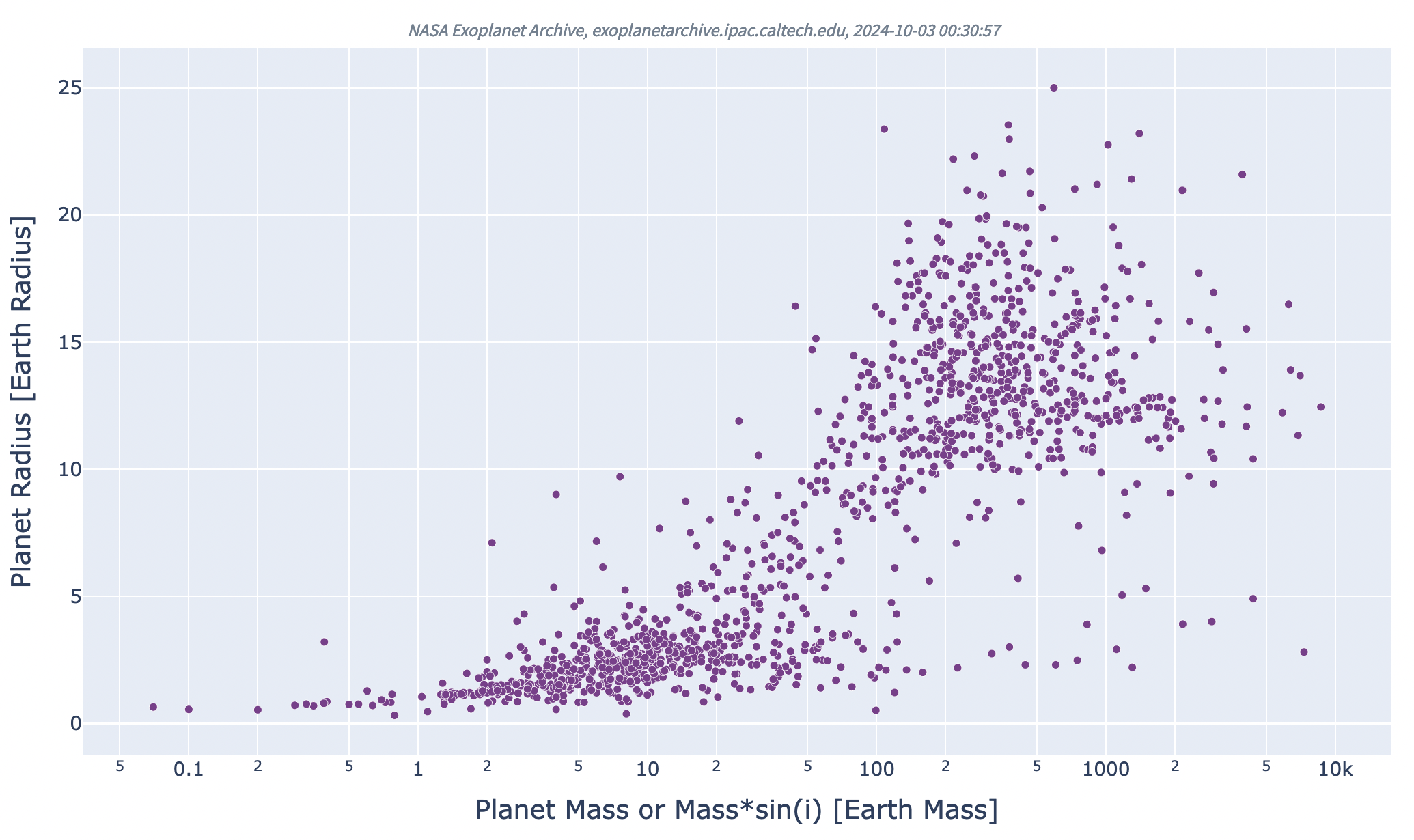
It's clear that most planets we have measured so far are either small-ish, roughly the size of the Earth, or big-ish, the size of Jupiter or Saturn. Fine.
Of course, many people have a special interest in the "terrestrial" exoplanets, because those are most likely to host lifeforms like ours; they are also the exoplanets future humans might be most interested in visiting. Let's take a closer look at the "terrestrial" region of this diagram -- for homework!
See the main course webpage for the deadline for this assignment.
Your assignment is investigate the properties of exoplanets in the "terrestrial" range: with masses 0 - 10 times the mass of the Earth. Please include only the objects with reliable measurements of both mass and radius, as described earlier.
 Copyright © Michael Richmond.
This work is licensed under a Creative Commons License.