You will often need to create graphs to illustrate your measurements, and show the degree to which they match predictions of some particular model. We recommend gnuplot as a tool for making graphs. It runs on all major platforms, it's free, it can create graphics good enough to publish, and it has some powerful features. You can acquire a copy from
This very brief introduction is meant to illustrate just a few of the program's features. In order to gain full credit, you must accomplish all the tasks listed below.
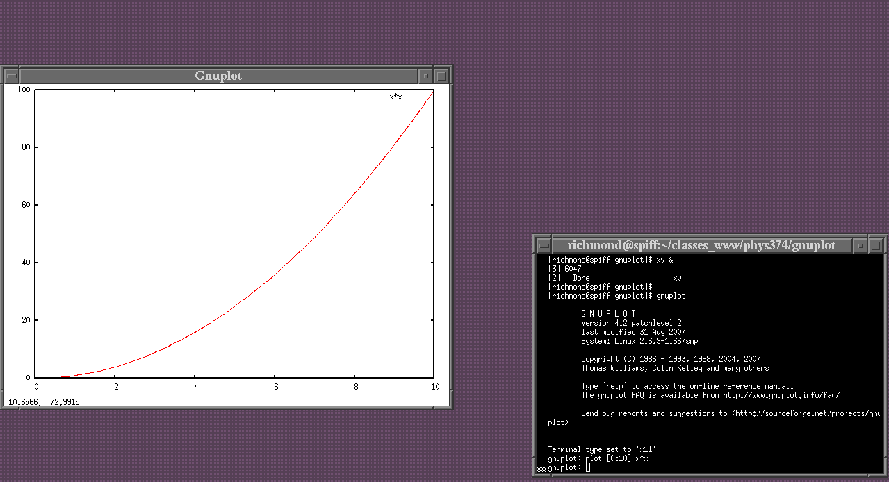
To start, let's create a very simple graph. When you start gnuplot, you should see two windows appear.
The "command window" (shown with black background, on the right) allows you to type commands. The "graph window" (white background, on the left) displays the results of those commands. The exact shape, size, and details of these windows may be different on your operating system.
The basic command to create a graph is plot. In the example above, I have typed
plot [0:10] x*x
which creates a graph ranging from 0 to 10 on the x-axis.
The y-axis is scaled automatically to show all the data.
In this case, I am plotting the function "x-squared",
which over the range x equals zero to ten
ranges from 0 to 100.
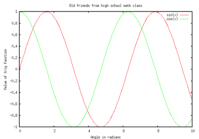
Gnuplot knows quite a few ordinary mathematical functions. For example, the sine and cosine functions:
plot [0:10] sin(x), cos(x)

This example shows
Hmmm. This example could be improved in a couple of ways. Let's put some labels on each axis, and give the graph a title.
         set xlabel "Angle in radians"
         set ylabel "Value of trig function"
         set title "Old friends from high school math class"
         plot [0:10] sin(x), cos(x)
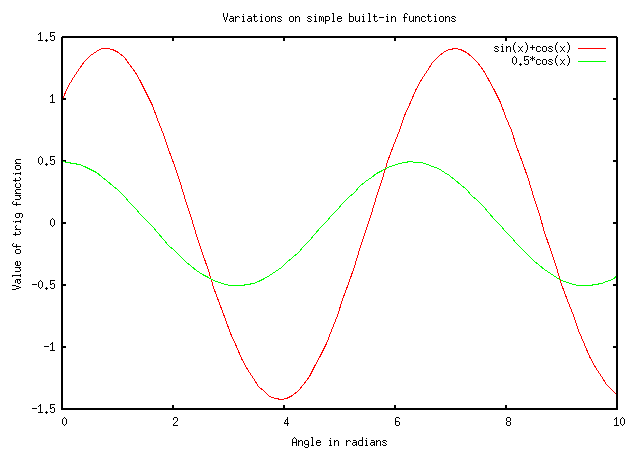
If you don't like the built-in functions, you can modify their values with simple arithmetical symbols. For example, I can plot the sum of the sine and cosine functions, plus another variation on the cosine function, like so:
         set xlabel "Angle in radians"
         set ylabel "Value of trig function"
         set title "Variations on simple built-in functions"
         plot [0:10] sin(x)+cos(x), 0.5*cos(x)
Okay, time for your first task. You perform a simple physics experiment: you drop a ball from a third-story window which is 50 meters above the ground. You measure its distance from the window as a function of time for 2 seconds.
Task 1: Create a graph which shows the height of the ball above the ground as a function of time, from t = 0 to t = 2 seconds. Give your graph reasonable labels.
In this course, you'll be making lots and lots of measurements. How can you make a graph which displays those measurements? It's as easy as one-two: one, create a simple text file in which each set of measurements occupies a different column. Two, run gnuplot and tell it to plot the desired columns of numbers.
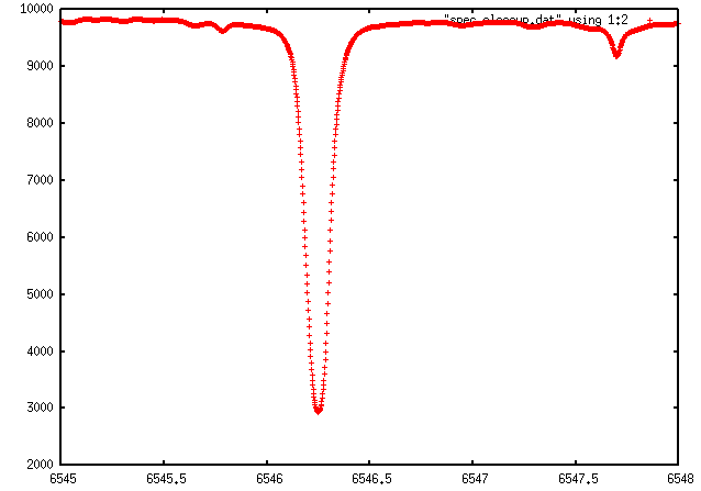
For example, I grabbed a small closeup of the solar spectrum in the visible from the BAse de donnees Solaire Sol website. My datafile is a plain ASCII text file, called spec_closeup.txt. You can grab a copy of the file if you like. The first few lines look like this.
# measurements of the solar spectrum, taken from
# the Base de donnees Solaire Sol website
#    http://bass2000.obspm.fr/home.php
# this is a small section of the solar spectrum
# in the optical.
#
#   lam         =    wavelength in Angstroms
#   intensity   =    intensity of spectrum in
#                        arbitrary units
#
# MWR 2/28/2009
#
#lam     intensity
6545     9779
6545.002 9777
6545.004 9776
6545.006 9775
6545.008 9773
Gnuplot will automatically ignore any line which is blank, or which starts with a comment character "#". The bulk of the file consists of lines which have two numbers: a wavelength (column 1), and an intensity (column 2). The columns can be separated by any combination of blank characters or tabs.
In order to plot this data, I can type into the command window
plot "spec_closeup.txt" using 1:2
Note
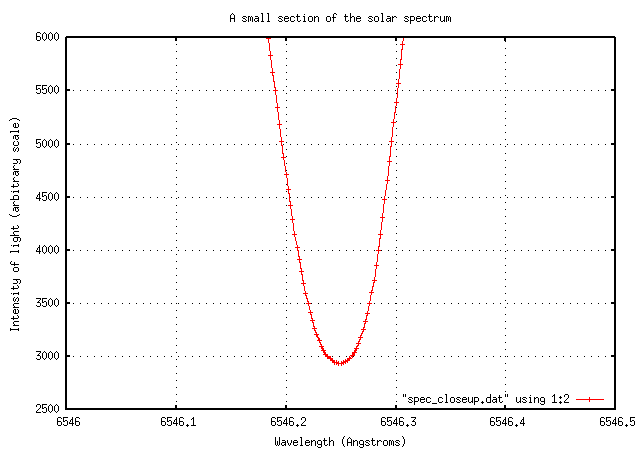
Hmmm. Let me make some improvements here. I'll add labels for the axes, of course. Also, I'll move the label from the top-right corner of the graph -- where it is being overwritten with datapoints -- to the lower-right corner. Next, I'll zoom in on the bottom of the absorption line, and connect the measurements with a line. Finally, I'll add some grid markings to help one determine rough values of individual measurements by eye.
         set xlabel "Wavelength (Angstroms)"
         set ylabel "Intensity of light (arbitrary scale)"
         set title "A small section of the solar spectrum"

         set key bottom right
         set grid
         plot [6546:6546.5][2500:6000] "spec_closeup.txt" using 1:2 with linespoints
You can change the default point symbols from plus-signs to squares or circles, and change the default linecolor from red to green or blue, by adding additional commands to the end of the plot command. For example,
plot [6546:6546.5][2500:6000] "spec_closeup.txt" using 1:2 with linespoints pt 4 lc 3
yields
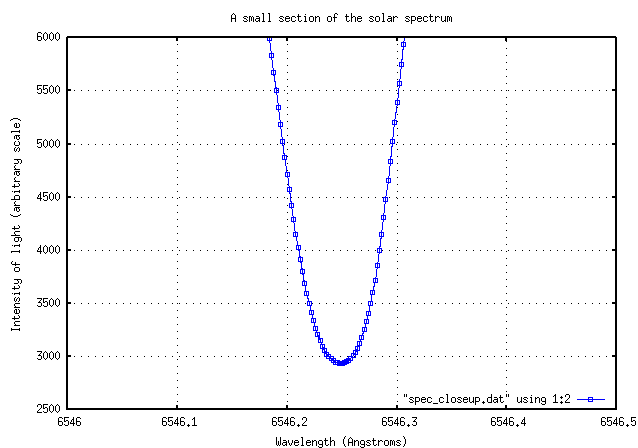
You can learn more about modifying the appearance of each dataset by typing help plot with in the gnuplot command window.
Task 2: Create a graph which shows a closeup of the weak absorption line in this datafile centered near 6547.7 Angstroms. Zoom in so that the data in this region cover your graph from left to right and from top to bottom.Use your graph to estimate the central wavelength of this line, the approximate width of the line, and its approximate depth.
Do you recall the properties of blackbody radiation? If not, you might consider doing a little review ... perhaps these notes from my lecture course might help.
The flux of energy per unit wavelength, emitted by a blackbody of temperature T, measured at a wavelength lambda, can be written as a rather ungainly equation:
It is possible to type this into gnuplot as an equation, for some particular value of T, since the exponential fuction is one of the built-in functions that it knows. However, typing all that would be pretty long, and it would be easy to make a single error. Moreover, if we wanted to compute the function for another temperature, we'd have to type in all those terms again. In a case like this, I recommend
For example, I wrote a little Perl script to compute the blackbody radiation over some range of wavelengths for a given temperature. I then ran it several times to create different datafiles, one for each temperature.
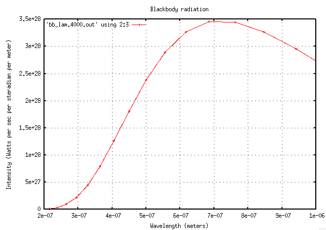
To plot the intensity of the spectrum as a function of wavelength isn't very difficult. I'll choose a range of wavelengths that extends a little beyond the range of human vision in each direction: from 200 nm to 1000 nm. Let's look at the spectrum of an object with a temperature of 4000 Kelvin.
         set xlabel "Wavelength (meters)"
         set ylabel "Intensity (Watts per sec per steradian per meter)"
         set title "Blackbody radiation"
         set grid
         set format x '%.1e'
         set key top left

         plot [200E-9:1000E-9] 'bb_lam.4000.txt' using 2:3 with linespoints
Now, if we try to compare the spectra of objects with different temperatures -- say, 6000 K and 2000 K -- we run into a bit of a problem.
         set xlabel "Wavelength (meters)"
         set ylabel "Intensity (Watts per sec per steradian per meter)"
         set title "Blackbody radiation"
         set grid
         set format x '%.1e'
         set key top left

         plot [200E-9:1000E-9] 'bb_lam.2000.txt' using 2:3 with linespoints,
                 'bb_lam.6000.txt' using 2:3 with linespoints
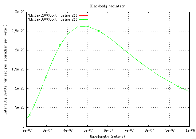
The intensity of the 6000-K body is so much larger than that of the 2000-K body that the cooler body's data is all crushed down to the bottom of the graph. Hmmm. This is a case for logarithmic axes. By changing the y-axis to a logarithmic scale, we can show quantities of vastly different magnitudes on the same graph. Watch.
(I'll also move the key's location, and change the text of the key from its default value.)
         set key bottom right
         set logscale y

         plot [200E-9:1000E-9]
                 'bb_lam.2000.txt' using 2:3 with linespoints t '2000 K',
                 'bb_lam.6000.txt' using 2:3 with linespoints t '6000 K'

There. Now we can see all the measurements for both bodies.
Task 3: (optional) Generate your own datafiles which contain intensity as a function of wavelength for bodies with temperatures of 3, 10, 30, and 100 Kelvin.
Create a single graph which shows the blackbody spectrum (intensity per unit wavelength as a function of wavelength) for bodies of all temperatures. Use a range of wavelengths which is wide enough to show the peak of all the spectra.
Task 4: Use your graph to measure the wavelength at which each body's spectrum has its peak. Create a new graph which shows the peak wavelength of a body as a function of the INVERSE of its temperature.
This page maintained by Michael Richmond. Last modified Oct 26, 2015.